7 More graphical grammars
Summary
There are a lot of more advanced plots that ggplot can help with, and many plots that have been developed and can be accessed through other packages as well. Some useful plotting capabilities include
Histogram and density plots
Composition plots
Area charts
Diverging bars
Correlograms
7.1 Visualizing distributions of more than one variable
Histogram plots are a simple way of understanding the mean and spread of a random variable. A histogram consists of intervals where for each interval, the height of the bar counts the number of data points that fall into that bin.
Start by making sure that we have the ggplot2 library in our instance of R.
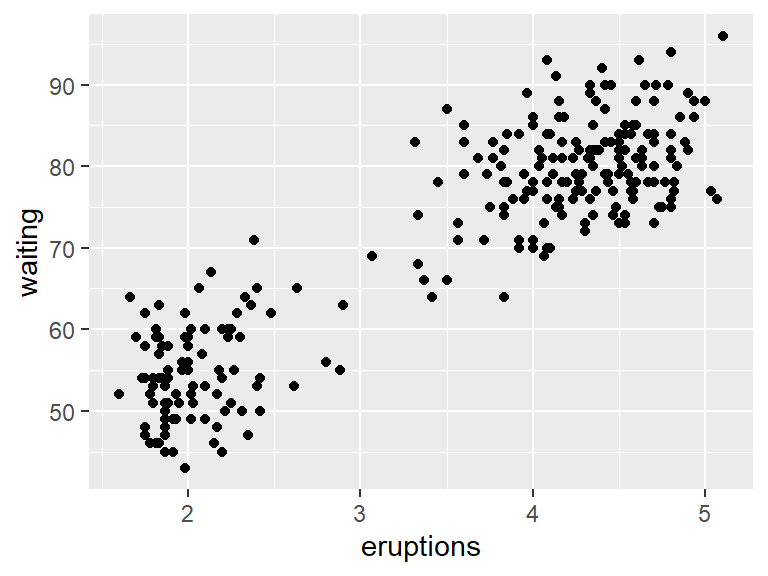
Now consider the faithful dataset.
##   eruptions waiting
## 1     3.600      79
## 2     1.800      54
## 3     3.333      74
## 4     2.283      62
## 5     4.533      85
## 6     2.883      55
This dataset contains the length of eruption time (in minutes) of the Old Faithful geyser, along with the waiting time (also in minutes) between eruptions.
Plotting this data as a scatterplot reveals a pattern.
To see if the eruptions times are evenly spread, a histogram can be used. A histogram takes numerical data and divides it into bins. The number of observations that fit in each bin are then plotted as a bar chart. This can be done with geom_histogram.
## `stat_bin()` using `bins = 30`. Pick better value
## `binwidth`.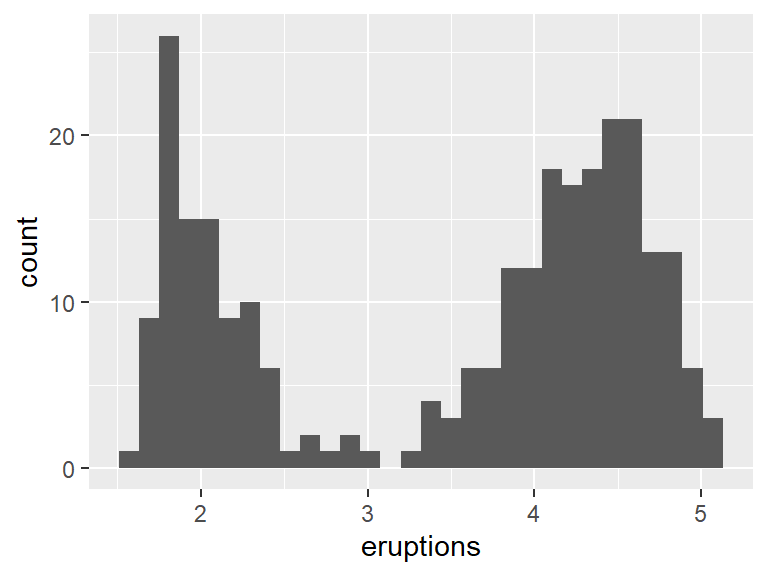
The same can be done for the waiting times.
## `stat_bin()` using `bins = 30`. Pick better value
## `binwidth`.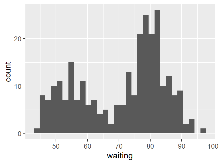
Notice that the bars are kind of ugly. Spruce things up by making the border of the bars black, and the interior of the bars white.
## `stat_bin()` using `bins = 30`. Pick better value
## `binwidth`.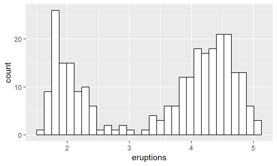
Going back to the original scatterplot, these points look very much like they lie on a line. Therefore, it is possible to put a least-squares line that is one way of giving a best fit line through the point cloud. Later more details will be given about how this line is constructed, but for now, create this line by using the lm (standing for linear model) with geom_smooth.
ggplot(data = faithful, aes(x = eruptions, y = waiting)) +
  geom_point() +
  geom_smooth(method = 'lm')
## `geom_smooth()` using formula = 'y ~ x'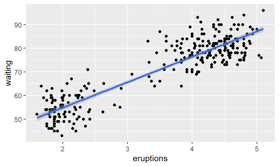
7.2 Composition plots
When you have values that comprise a population, a composition plot is a good way to visualize the data. For instance, the population of the states of California, Texas, Florida, and South Dakota are 37, 25, 19, and 1 million (rounded to the nearest million). First place this into a tibble using the tibble function. To use this function, we first load the tibble package.
Next build the tibble.
## # A tibble: 4 × 2
##   state value
##   <chr> <dbl>
## 1 CA       37
## 2 TX       25
## 3 FL       19
## 4 SD        1
Next, build a bar plot. We want to create a single bar, so the x variable in the aes will be blank. Then we want to fill the inside of the bar by color based on the state. Finally, we want the height of the bar to be given by the value variable. So we will set the stat parameter to be "identity".
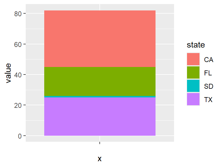
This can be made prettier by removing the background, making the bar horizontal, and making it a bit narrower. The theme_void gets rid of all axis and labels.
ggplot(pop) +
  geom_bar(aes(x = "", y = value, fill = state),
           stat = "identity", width = 0.4) +
  coord_flip() +
  theme_void()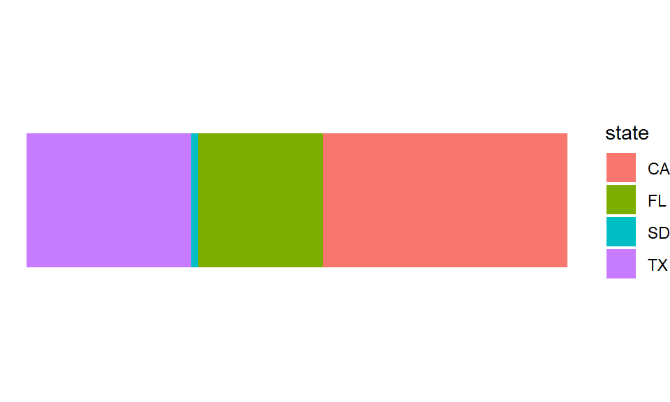
Now, a more common type of composition plot is the pie chart. The short advice on pie charts is to never use them. They tend to make smaller slices of the composition look bigger than they actually are. But if you absolutely, positively, must have a pie chart, you can make them by transforming the bar plot using the coord_polar transform applied to the \(y\)-axis.
ggplot(pop) +
  geom_bar(aes(x = "", y = value, fill = state),
           stat = "identity", width = 0.4) +
  coord_polar("y") +
  theme_void()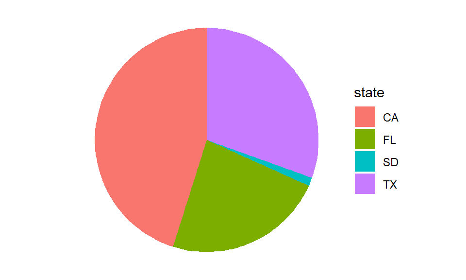
7.3 Correlograms
Earlier we saw that a scatterplot can show the relationship between 2 variables. Suppose we have more variables? Then a correlogram is an effective way to show relationships. The correlation between two variables is an indicator of how closely they are related.
Correlation runs between 1 and -1. If two variables are positively correlated, then when one variable is larger on average the other variable is larger. When two variables are negatively correlated, we have that if one variable is larger than on average the other variable is smaller.
You can find the correlation between all pairs of continuous variables in a data set using the cor function in R. For instance, the mtcars data set (part of the ggplot2 package) contains 11 variables. To find the correlation between them, we can use the cor function. The round function can then be used to round the values of the correlation to 2 decimal places as follows.
##        mpg   cyl  disp    hp  drat    wt  qsec    vs    am  gear  carb
## mpg   1.00 -0.85 -0.85 -0.78  0.68 -0.87  0.42  0.66  0.60  0.48 -0.55
## cyl  -0.85  1.00  0.90  0.83 -0.70  0.78 -0.59 -0.81 -0.52 -0.49  0.53
## disp -0.85  0.90  1.00  0.79 -0.71  0.89 -0.43 -0.71 -0.59 -0.56  0.39
## hp   -0.78  0.83  0.79  1.00 -0.45  0.66 -0.71 -0.72 -0.24 -0.13  0.75
## drat  0.68 -0.70 -0.71 -0.45  1.00 -0.71  0.09  0.44  0.71  0.70 -0.09
## wt   -0.87  0.78  0.89  0.66 -0.71  1.00 -0.17 -0.55 -0.69 -0.58  0.43
## qsec  0.42 -0.59 -0.43 -0.71  0.09 -0.17  1.00  0.74 -0.23 -0.21 -0.66
## vs    0.66 -0.81 -0.71 -0.72  0.44 -0.55  0.74  1.00  0.17  0.21 -0.57
## am    0.60 -0.52 -0.59 -0.24  0.71 -0.69 -0.23  0.17  1.00  0.79  0.06
## gear  0.48 -0.49 -0.56 -0.13  0.70 -0.58 -0.21  0.21  0.79  1.00  0.27
## carb -0.55  0.53  0.39  0.75 -0.09  0.43 -0.66 -0.57  0.06  0.27  1.00
Even rounded, the matrix of correlations is difficult to understand. A correlogram is a good way to turn those numbers into colors. The package ggcorrplot is helpful here. As always, first load the library (using install.packages("ggcorrplot") if not already installed) using
Next create the correlogram with the ggcorrplot function from the ggcorrplot
## Warning: `aes_string()` was deprecated in ggplot2 3.0.0.
## ℹ Please use tidy evaluation idioms with `aes()`.
## ℹ See also `vignette("ggplot2-in-packages")` for more
##   information.
## ℹ The deprecated feature was likely used in the ggcorrplot
##   package.
##   Please report the issue at
##   <https://github.com/kassambara/ggcorrplot/issues>.
## This warning is displayed once every 8 hours.
## Call `lifecycle::last_lifecycle_warnings()` to see where
## this warning was generated.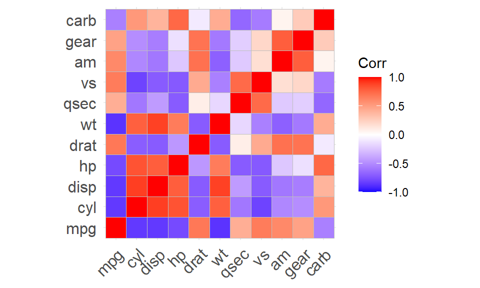
Notice that (for historical reasons), the order of the rows was reversed from when corr was used to get a matrix. This helps us pick out squares of high and low correlation, but is not much help when it comes to finding the variables that are highly positively (or negatively) correlated with each other. To see those relationships, we can reorder the rows and columns by setting the parameter hc.order to TRUE.
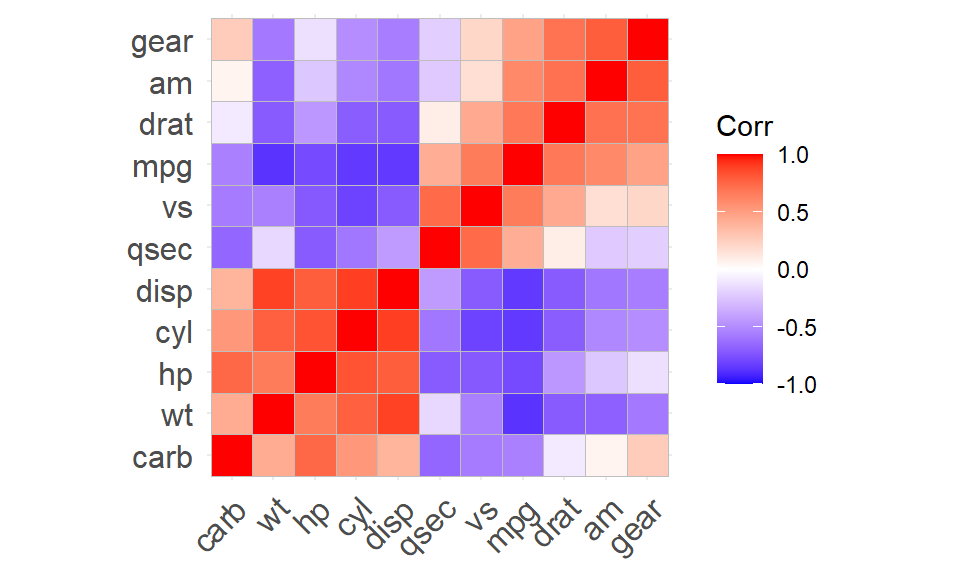
This tries to make the order of the variables as useful as possible. The five variables in the lower left square are highly correlated with each other, and negatively correlated (mostly) with the other six variables.
7.4 Diverging bars
Often we wish to use bar graphs to show both positive and negative values. For instance, perhaps we are measuring how much above (or below) average the highway mileage is. These are often referred to as diverging bars plots.
Before we can do this, we need to clean our data a bit. When we look at the rows of the mtcars, we see that the rows of the table actually contain more data, the name of the car itself!
##                    mpg cyl disp  hp drat    wt  qsec vs am gear carb
## Mazda RX4         21.0   6  160 110 3.90 2.620 16.46  0  1    4    4
## Mazda RX4 Wag     21.0   6  160 110 3.90 2.875 17.02  0  1    4    4
## Datsun 710        22.8   4  108  93 3.85 2.320 18.61  1  1    4    1
## Hornet 4 Drive    21.4   6  258 110 3.08 3.215 19.44  1  0    3    1
## Hornet Sportabout 18.7   8  360 175 3.15 3.440 17.02  0  0    3    2
## Valiant           18.1   6  225 105 2.76 3.460 20.22  1  0    3    1
This is actually part of the data, and so it is important to create a variable in the table to hold these names. Use the mutate command in the dplyr package to accomplish this. Load in the dplyr package:
and then mutate our data using the rownames function
##                    mpg cyl disp  hp drat    wt  qsec vs am gear carb
## Mazda RX4         21.0   6  160 110 3.90 2.620 16.46  0  1    4    4
## Mazda RX4 Wag     21.0   6  160 110 3.90 2.875 17.02  0  1    4    4
## Datsun 710        22.8   4  108  93 3.85 2.320 18.61  1  1    4    1
## Hornet 4 Drive    21.4   6  258 110 3.08 3.215 19.44  1  0    3    1
## Hornet Sportabout 18.7   8  360 175 3.15 3.440 17.02  0  0    3    2
## Valiant           18.1   6  225 105 2.76 3.460 20.22  1  0    3    1
##                             carname
## Mazda RX4                 Mazda RX4
## Mazda RX4 Wag         Mazda RX4 Wag
## Datsun 710               Datsun 710
## Hornet 4 Drive       Hornet 4 Drive
## Hornet Sportabout Hornet Sportabout
## Valiant                     Valiant
The next thing to do is to center and standardize our data for mpg. This is accomplished by subtracting the sample mean of the data, and dividing by the sample standard deviation. Again, the mutate function is used to do this. Because standardized data is also known as the z-score, call the new variable mpg_z. The select function can be used to only keep the carname and mpg_z variables.
##                             carname      mpg_z
## Mazda RX4                 Mazda RX4  0.1508848
## Mazda RX4 Wag         Mazda RX4 Wag  0.1508848
## Datsun 710               Datsun 710  0.4495434
## Hornet 4 Drive       Hornet 4 Drive  0.2172534
## Hornet Sportabout Hornet Sportabout -0.2307345
## Valiant                     Valiant -0.3302874
Finally, divide our cars into types: say that mpg_type is "above" if mpg_z is at least 0, and otherwise it is type "below". The ifelse function can be used to accomplish this.
##                             carname      mpg_z mpg_type
## Mazda RX4                 Mazda RX4  0.1508848    above
## Mazda RX4 Wag         Mazda RX4 Wag  0.1508848    above
## Datsun 710               Datsun 710  0.4495434    above
## Hornet 4 Drive       Hornet 4 Drive  0.2172534    above
## Hornet Sportabout Hornet Sportabout -0.2307345    below
## Valiant                     Valiant -0.3302874    below
At last the dataset is prepared to make the plot! The bars for the above average mpg will be colored a shade of green. This shade can be represented as “#00ba38” (one way to describe colors is with six hexadecimal digits.) Similarly, “#f8766d” is a shade of red. Use the helper function reorder within the aes function to rank the cars from best mpg to worst.
Flip the horizontal and vertical axes so that our bars are horizontal.
Set up the colors to fill the bars using scale_fill_manual.
The theme_classic makes for a nice presentation.
Finally, use xlab and ylab to relabel our \(x\) and \(y\) axes. Putting this all together gives the graph:
ggplot(d4, aes(x = reorder(carname, mpg_z), y = mpg_z)) +
  coord_flip() +
  geom_bar(stat = "identity", aes(fill = mpg_type)) +
  scale_fill_manual(
    name = "Mileage",
    labels = c("Above Average", "Below Average"),
    values = c("above" = "#00ba38", "below" = "#f8766d")
  ) +
  ylab("Standardized mpg") +
  xlab("Make and Model") +
  theme_classic()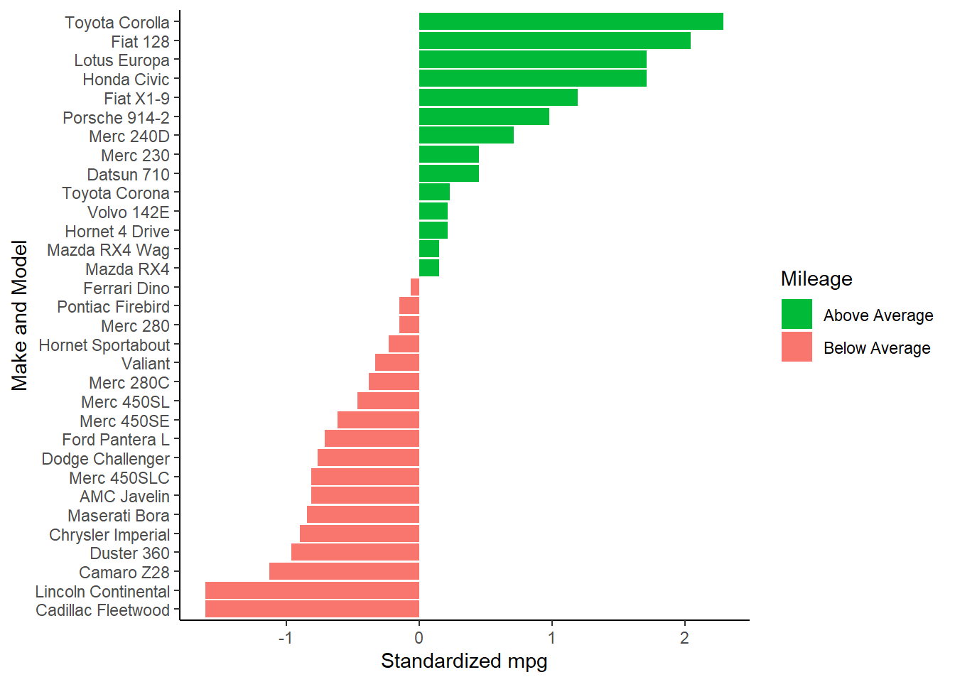
7.5 Area graphs
For financial data, area charts are a useful way to view values changing in time. Consider the data set economics, which includes data about the US from 1967 up to 2015. This data set is part of the ggplot2 package. The psavert variable gives the personal savings rate. Suppose that we are not interested in the savings rate itself, but in how the rate has changed over time. The diff command can find differences in a time series. For instance,
diff(c(1, 5, 3)) returns a vector \((4, -2)\), as 4 is the difference between 1 and 5, and -2 is the difference between 5 and 3.
Consider the percentage change by dividing the difference vector by the original vector. As before, use the mutate command to store this data in a new variable. Use the filter function to only keep earlier dates.
Plot these differences using geom_area, which fills in the region between the line plot and the \(x\)-axis to give an area chart.
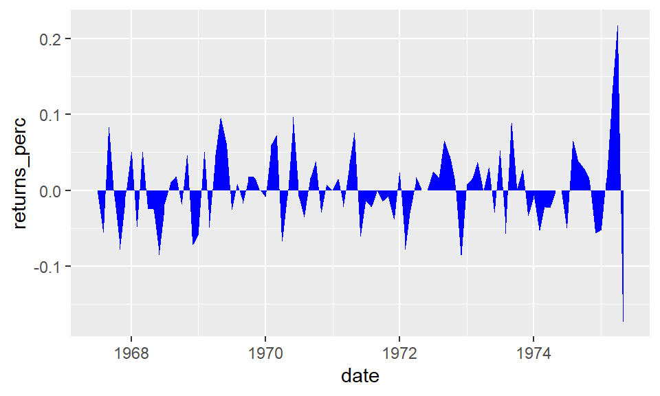
It looks somewhat better with proper titles and rotated labels for the dates. These can be done with the labs and theme functions.
gac +
  labs(title = "Area Chart",
       subtitle = "Percentage Returns for Personal Savings",
       y = "% Returns for Personal savings",
       caption = "Source: ggplot2::economics data set") +
  theme(axis.text.x = element_text(angle = 45, vjust = 1, hjust = 1))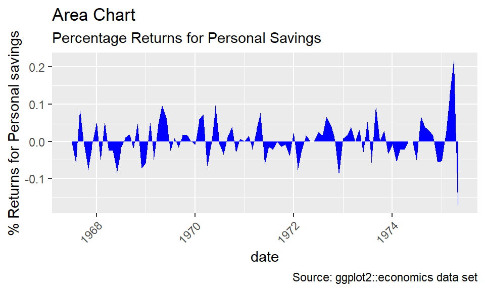
Questions
In the 2018 US Census American Community Survey (Table B03002), the following breakdown of the population of New York City by Race was given:
library(tibble)
df <- tibble(
  race = c("White", "Black or African American", "Some Other Race", "Asian",
           "Two or More Races", "American Indian and Alaska Native",
           "Native Hawaiian and Other Pacific Islander"),
  pop = c(3603057, 2049418, 1277050, 1177700, 296074, 36075, 4339)
)
This can be printed as a table as follows:
| race | pop |
|---|---|
| White | 3603057 |
| Black or African American | 2049418 |
| Some Other Race | 1277050 |
| Asian | 1177700 |
| Two or More Races | 296074 |
| American Indian and Alaska Native | 36075 |
| Native Hawaiian and Other Pacific Islander | 4339 |
Create a composition plot that is a horizontal bar that is colored with a legend according to the different races represented in the survey.
Consider the DanishWelfare dataset in the package vcd.
## Loading required package: grid## Freq Alcohol Income Status Urban
## 1 1 <1 0-50 Widow Copenhagen
## 2 4 <1 0-50 Widow SubCopenhagen
## 3 1 <1 0-50 Widow LargeCity
## 4 8 <1 0-50 Widow City
## 5 6 <1 0-50 Widow Country
## 6 14 <1 0-50 Married CopenhagenCreate a plot of the
Statusvariable that reports marital status versus theUrbanvariable where the size of each variable is proportional toFreq.Do the same with a tile plot using different colors of tiles using geom_tile to show
Freq.
A violin plot is a method of displaying variation in a continuous variable that combines aspects of a boxplot and a histogram. Consider the following plot of data from the mtcars dataset.
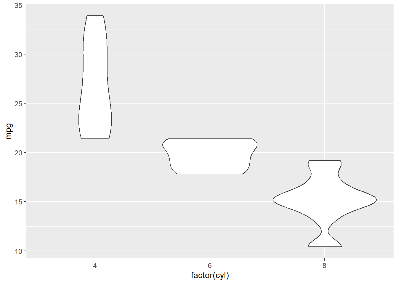
Note that in the aesthetic we used factor(cyl) rather than just cyl. This forces the plot to treat cyl as a categorical variable rather than a continuous one.
The histogram for each factor is mirrored with vertical symmetry, giving it a look that is kind of like a violin. That is the reason behind the name.
From this plot, what happens to miles per gallon as the number of cylinders increases?
Create a violin plot for
mpgversusgear.For which number of forward gears is the mpg the best?
The cut_number helper function takes a continuous variable, and divides it into bins so that it can be treated as a categorical variable. For instance, in the diamonds dataset from the ggplot2 package, the carat variable can be split into 20 groups observations, and the prices of those carats presented as a boxplot with:
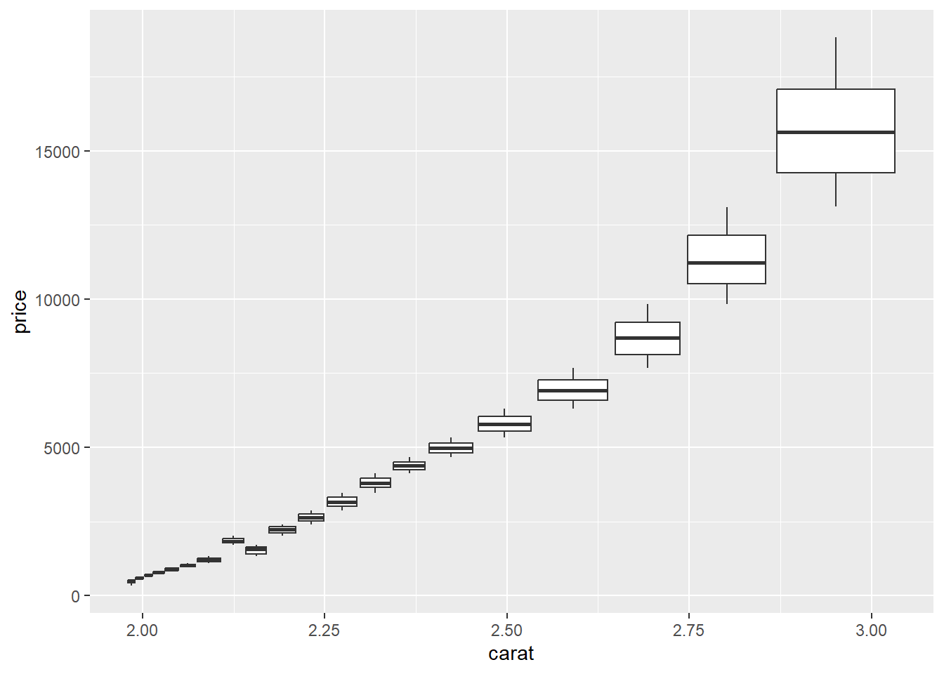
Does
priceappear to increase strictly linearly withcarat?Does the variation in
priceappear to get larger or smaller ascaratincreases?
Consider the starwars data set from package dplyr.
Create a scatter plot of the mass versus the height with a least squares prediction line.
What observation has the outlier among mass?
Repeat part a after removing this outlier.