19 Evaluating models
Summary
The package modelr contains functions for evaluation of models.
add_residuals Gives the residuals from predictors and the model.
gather_predictions Bring together predictions from more than one model for comparison.
gather_residuals Bring together residuals from more than one model for comparison.
model_matrix For linear models, returns the matrix \(X\) of observations for that model.
19.1 What makes a model good?
There are several different aspects that make for a good model. Often scientific models try to explain important behavior by understanding the underlying forces that drive the process. Other models work by trying to predict the response from experiments based on one or more predictor variables. Such a model is best when it predicts as accurately as possible. Therefore, it is important to have a measure of how close the model predicts the response.
19.1.1 Finding residuals
Given a prediction, recall that the residual for a given observation is the difference between the prediction from the model and the true value.
Start with the linear model for the sim1 data from the modelr package.
##
## Call:
## lm(formula = y ~ x, data = sim1)
##
## Coefficients:
## (Intercept)            x
##       4.221        2.052
The residuals for the predictions of the model can be found using the add_residuals. This takes as parameters the data and the model for the data.
## # A tibble: 30 × 3
##        x     y    resid
##    <int> <dbl>    <dbl>
##  1     1  4.20 -2.07
##  2     1  7.51  1.24
##  3     1  2.13 -4.15
##  4     2  8.99  0.665
##  5     2 10.2   1.92
##  6     2 11.3   2.97
##  7     3  7.36 -3.02
##  8     3 10.5   0.130
##  9     3 10.5   0.136
## 10     4 12.4   0.00763
## # ℹ 20 more rows
If the model is working well, then the expectation is that some of the residuals are positive, and some are negative. If they are all positive (or all negative), then the constant term of the model could be improved.
In fact, there are two important properties that are nice for the residuals to have.
Centered The residuals should have mean 0. The constant term of the model can always be adjusted to make this true.
Independent If the assumption is that the true values are independent of each other, then the residuals for the predictions will also be independent.
The least squares line fitted earlier is designed to make the mean of the residuals equal to 0.
## # A tibble: 1 × 1
##   average_resid
##           <dbl>
## 1      5.12e-15
Note that the result is not exactly zero, since computers do not use infinitely long decimal representations. Instead, the notation 5.121872e-15 means the number \(5.12872 \cdot 10^{-15}\). This is close to machine precision, the smallest number that a floating point number can distinguish from zero.
The mean of the residuals is extremely close to 0. In addition, the residuals should be spread out. Clumping of the residuals indicates that the model could be improved. To test the spread a kernel density plot or a histogram can be used.
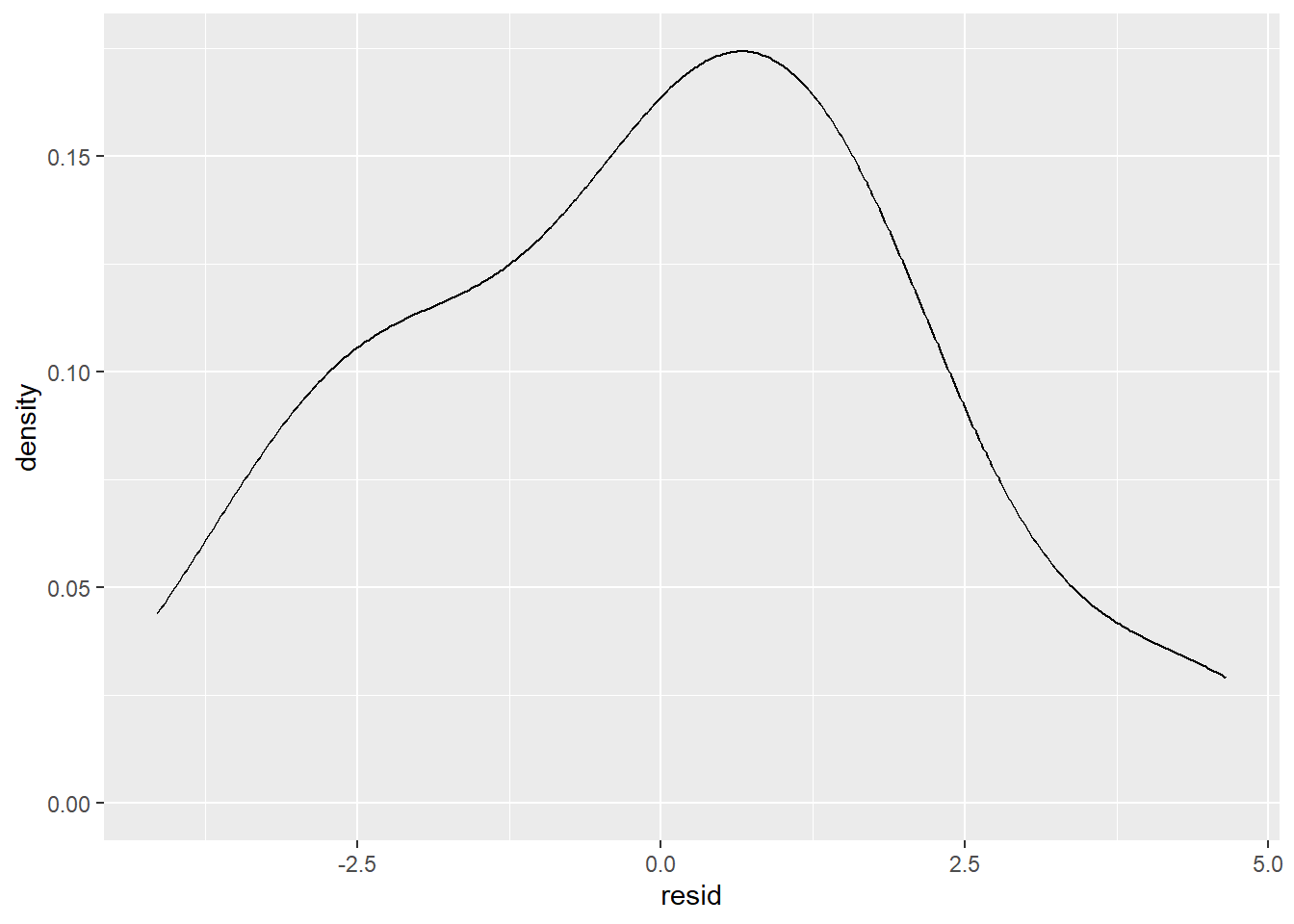
This type of plot is not uncommon for residuals. There does appear to be some slight skewness, but this usually happens just by chance in data, and should not be taken as definitive proof that there is a missing term in the model.
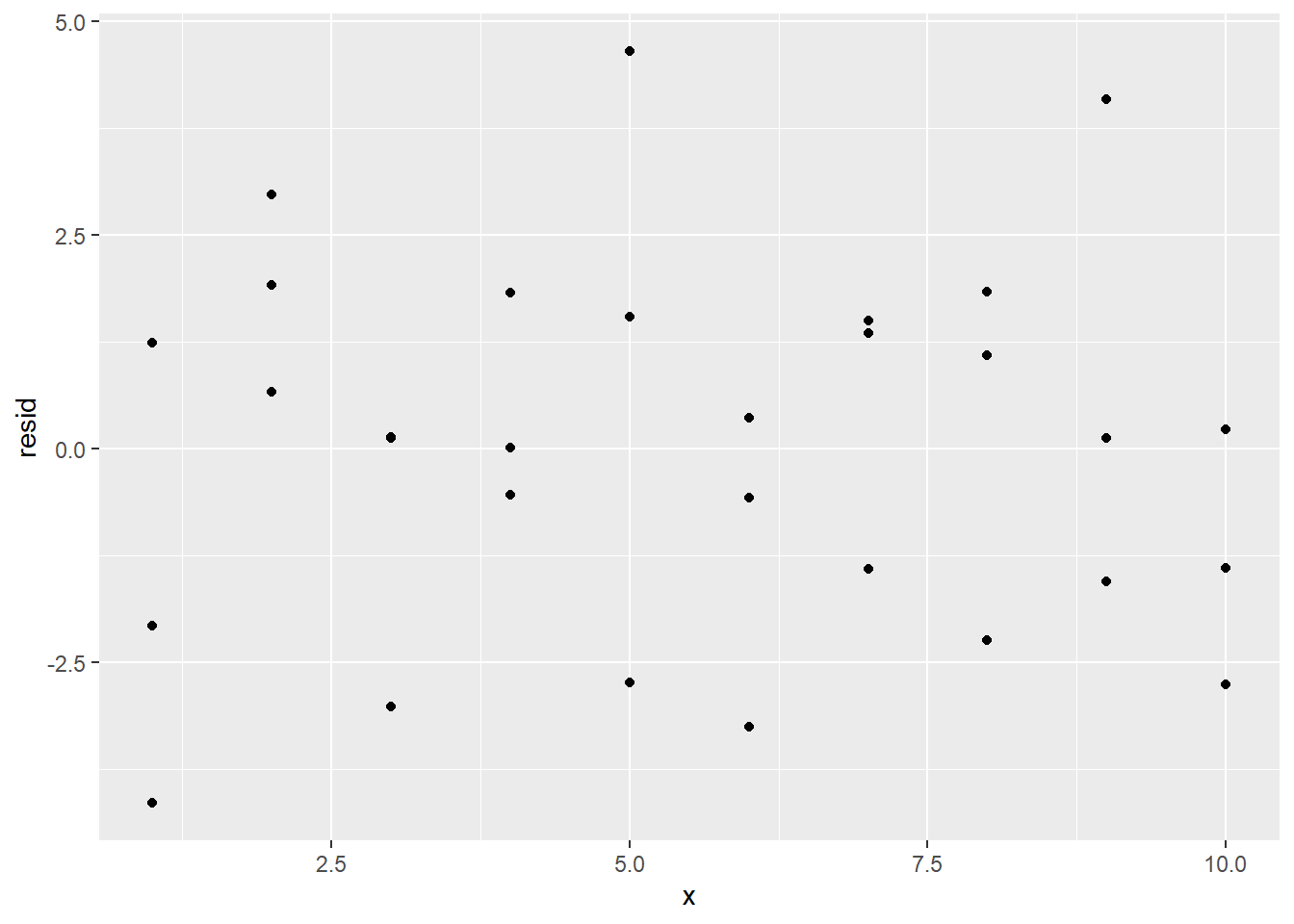
If the model is correct, then the residuals should all be independent of each other, there should not be a pattern. Note that the residuals are placed in a variable resid. A scatterplot can visually display the spread.
If there had been a pattern, it might have looked something like this instead:
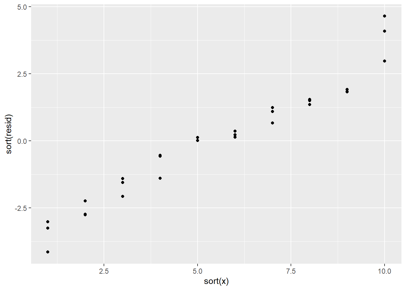
Those values are not independent of each other!
19.2 Notation for models
Statistical model notation is used to quickly describe how the response varies with the predictors in the model. For instance, \[ y \sim x \] is the same as the model \[ y = c_0 + c_1 x + \epsilon. \]
Consider the model \[ y \sim x_1 + x_2 + x_1 x_2. \] This statistical model means that the data is being assumed to have been generated by \[ y = c_0 + c_1 x_1 + c_2 x_2 + c_3 x_1 x_2 + \epsilon. \]
With this model, say that there are two predictors, \(x_1\), \(x_2\), and an interaction predictor \(x_1 x_2\). The constant term is usually not considered a predictor.
The process of choosing parameter values for a model based on the data is called fitting a model.
19.3 Continuous and categorical
So what happens if you have both a continuous variable and a categorical variable in a model? The dataset sim3 contains such a situation.
## # A tibble: 120 × 5
##      x1 x2      rep      y    sd
##   <int> <fct> <int>  <dbl> <dbl>
## 1     1 a         1 -0.571     2
## 2     1 a         2  1.18      2
## 3     1 a         3  2.24      2
## 4     1 b         1  7.44      2
## 5     1 b         2  8.52      2
## # ℹ 115 more rows
Visualize the data with a scatterplot colored based on the value in x2:
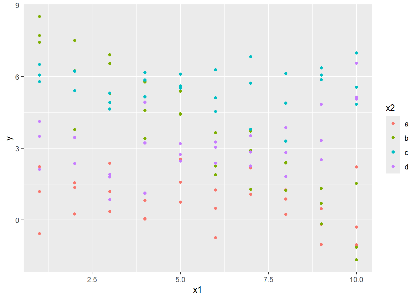
Here x1 is numerical, and x2 is categorical. Consider fitting a model both without and with interactions.
19.3.1 Comparing models with gather_predictions
Although this can be done using joins, the gather_predictions offers a quick way of getting two or more predictions for multiple models simultaneously for a dataset.
To use this on sim3, first build a grid of x1 and x2 values to be predicted with mod1 and mod2 using data_grid, then bring the predictions from the models together with gather_predictions.
## # A tibble: 80 × 4
##   model    x1 x2     pred
##   <chr> <int> <fct> <dbl>
## 1 mod1      1 a      1.67
## 2 mod1      1 b      4.56
## 3 mod1      1 c      6.48
## 4 mod1      1 d      4.03
## 5 mod1      2 a      1.48
## # ℹ 75 more rows
Note that the data produced is tidy. A variable model has been created that indicates if the prediction is coming from mod1 or mod2. Therefore this can directly be used with our visualization tools. Two facets can be used to look at these predictions for the two models at the same time.
ggplot(data = sim3, aes(x1, y, color = x2)) +
  geom_point() +
  geom_line(data = grid, aes(y = pred)) +
  facet_wrap(~ model)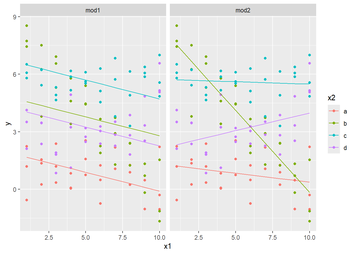
This shows the effect of having an interaction versus not having an interaction. The slope of each line in the first model is the same: the x2 variable effectively just changes the \(y\)-intercept.
On the other hand, when there is an interaction between the x1 and x2 variable, the slope is allowed to change for each value of x2. This second model fits the data better. The fact that the slopes change so dramatically to fit the data means that the slope should be changing with the value in x2, and that an interaction parameter is warranted.
19.3.2 Comparing models with gather_residuals
A look at the residuals bears this out. The following scatterplots use facets to break it down by level and model. The gather_residuals function is used to give the residuals for the predictions for the two different models in one tibble.
sim3_res <- sim3 |>
  gather_residuals(mod1, mod2)

ggplot(sim3_res, aes(x1, resid, col = x2)) +
  geom_point() +
  facet_grid(model ~ x2)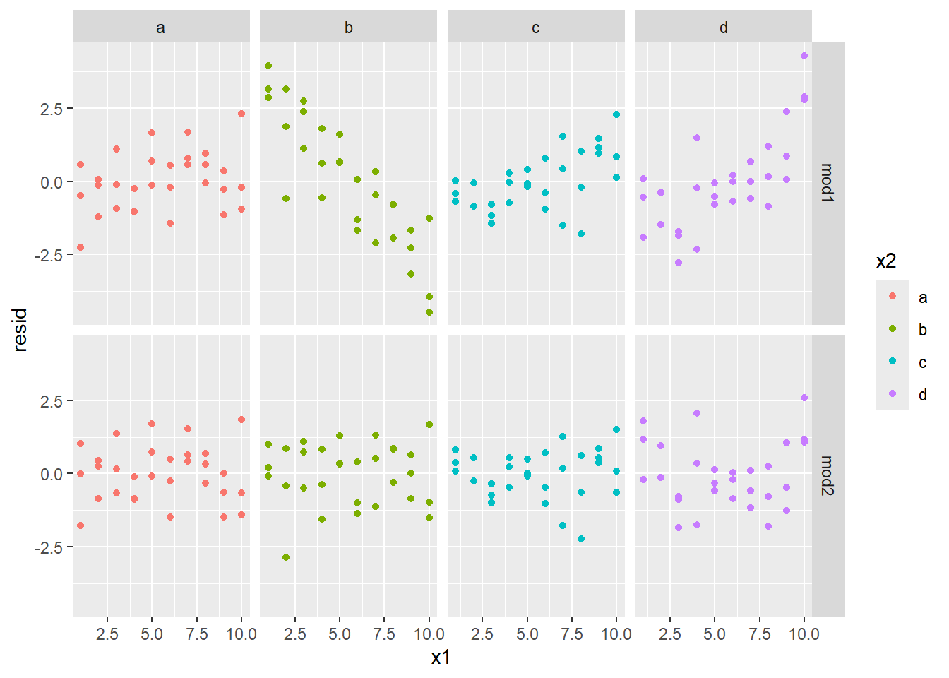
The second model (mod2) has residuals that look independent, while the residuals in mod1 look like they have a strong pattern to them (especially when x2 equals b.) This gives strong evidence that mod2 is the better predictor.
19.4 Using matrix notation
Consider the following data set.
## # A tibble: 4 × 3
##       y     a     b
##   <dbl> <dbl> <dbl>
## 1   4.2   2.3   5.2
## 2   5.6   1.1   6.9
## 3   2.2  -1.4   2.6
## 4   1.7   0.3   2.4
If we build the model \(y \sim a + b\), then we have two predictor variables, and four observations. We could write down the model mathematically as:
\[\begin{align*} y_1 &= c_0 + c_1 a_1 + c_2 b_1 + \epsilon_1 \\ y_2 &= c_0 + c_1 a_2 + c_2 b_2 + \epsilon_2 \\ y_3 &= c_0 + c_1 a_3 + c_2 b_3 + \epsilon_3 \\ y_4 &= c_0 + c_1 a_4 + c_2 b_4 + \epsilon_4, \end{align*}\]
Note that the \(c_0\), \(c_1\), \(c_2\), and \(c_3\) values are repeated in every equation. We can write this more succinctly using matrix notation. These same four equations can be written as: \[ \begin{pmatrix}y_1 \\ y_2 \\ y_3 \\ y_4 \end{pmatrix} = \begin{pmatrix} 1 & a_1 & b_1 \\ 1 & a_2 & b_2 \\ 1 & a_3 & b_3 \\ 1 & a_4 & b_4 \end{pmatrix} \begin{pmatrix}c_0 \\ c_1 \\ c_2 \end{pmatrix} + \begin{pmatrix} \epsilon_1 \\ \epsilon_2 \\ \epsilon_3 \\ \epsilon_4 \end{pmatrix} \]
We can further abbreviate the equations by setting \[ Y = \begin{pmatrix}y_1 \\ y_2 \\ y_3 \\ y_4 \end{pmatrix},\ X = \begin{pmatrix} 1 & a_1 & b_1 \\ 1 & a_2 & b_2 \\ 1 & a_3 & b_3 \\ 1 & a_4 & b_4 \end{pmatrix},\ c = \begin{pmatrix}c_0 \\ c_1 \\ c_2 \end{pmatrix},\ \epsilon = \begin{pmatrix} \epsilon_1 \\ \epsilon_2 \\ \epsilon_3 \\ \epsilon_4 \end{pmatrix}. \]
Then we can write the final model as: \[ Y = Xc + \epsilon. \]
Often in statistics, \(\beta\) is used for the vector rather than \(c\). This makes the model \(Y = X \beta + \epsilon\).
If we have \(n\) observations, and \(p\) predictor variables then \(Y\) is an \(n\) by \(1\) matrix (also called a column vector), \(X\) is an \(n\) by \(p + 1\) matrix, \(c\) is a \(p + 1\) by 1 matrix (or column vector), and \(\epsilon\) is an \(n\) by 1 matrix (or column vector).
The modelr package can calculate the matrix \(X\) for you with the model_matrix function.
## # A tibble: 4 × 2
##   `(Intercept)`     a
##           <dbl> <dbl>
## 1             1   2.3
## 2             1   1.1
## 3             1  -1.4
## 4             1   0.3
Note that the first column is just 1’s. This indicates that no matter what the \(x_1\) value is, the first column just returns the constant term of the model. We can make the matrix more complicated by adding a second predictor:
## # A tibble: 4 × 3
##   `(Intercept)`     a     b
##           <dbl> <dbl> <dbl>
## 1             1   2.3   5.2
## 2             1   1.1   6.9
## 3             1  -1.4   2.6
## 4             1   0.3   2.4
Finally, we add the interaction term:
## # A tibble: 4 × 4
##   `(Intercept)`     a     b `a:b`
##           <dbl> <dbl> <dbl> <dbl>
## 1             1   2.3   5.2 12.0
## 2             1   1.1   6.9  7.59
## 3             1  -1.4   2.6 -3.64
## 4             1   0.3   2.4  0.72
It is represented by either a * b or a:b. This is known as Wilkinson-Rodgers notation .
What about if the predictor is a categorical rather than a numerical value? For instance, consider the following dataset.
Because the gender variable is categorical, when creating the model matrix, it gets translated to either 0 or 1 depending on it if it is male or female. It appends the level male to the end of gender to form gendermale to indicate that a 1 means that the gender level is male.
## # A tibble: 3 × 2
##   `(Intercept)` gendermale
##           <dbl>      <dbl>
## 1             1          1
## 2             1          0
## 3             1          1
(Note that there is no point in creating a genderfemale variable. Since the sum of the two vectors would be 1, the two columns together with the constant column would be linearly dependent. Therefore all information needed is contained in the one variable.)
Consider the sim2 dataset from the package.
## # A tibble: 40 × 2
##   x         y
##   <chr> <dbl>
## 1 a      1.94
## 2 a      1.18
## 3 a      1.24
## 4 a      2.62
## 5 a      1.11
## # ℹ 35 more rows
The variable x has four levels, a, b, c, and d.
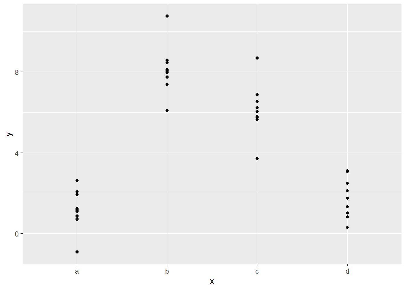 Because this is categorical data, a model will just try to fit the average value for each of the levels.
## # A tibble: 4 × 2
##   x      pred
##   <chr> <dbl>
## 1 a      1.15
## 2 b      8.12
## 3 c      6.13
## 4 d      1.91
It turns out that the sample average of the values minimizes the sum of the squares of the distance from the prediction. This can be seen in the following plot:
ggplot(sim2, aes(x)) +
  geom_point(aes(y = y)) +
  geom_point(data = grid, aes(y = pred), color = "red", size = 4)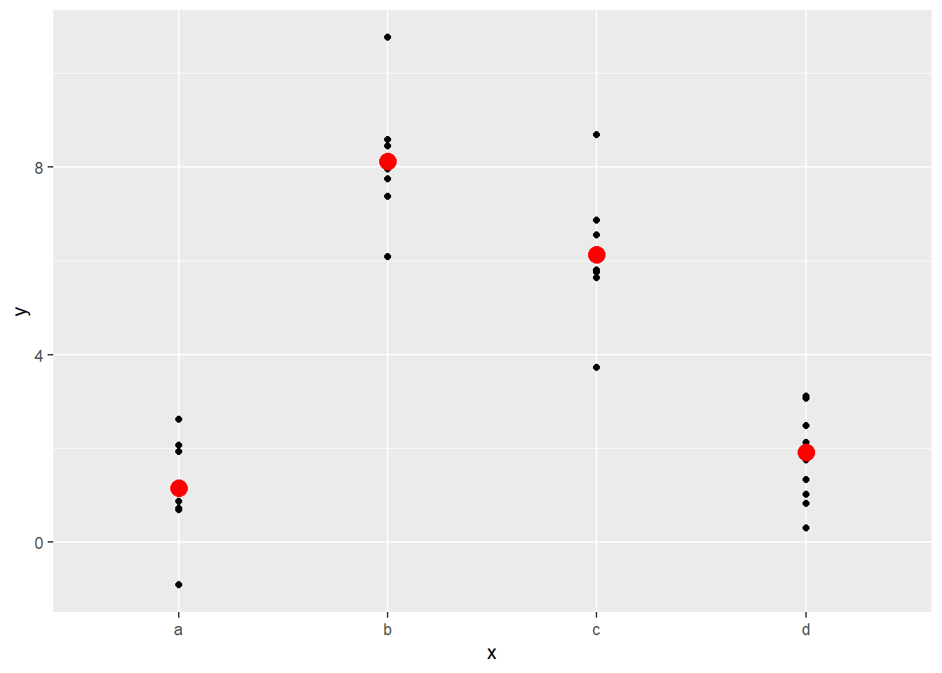
Note that if you try to predict the value where there are no observations, you will get an error message:
## Error in model.frame.default(Terms, newdata, na.action = na.action, xlev = object$xlevels): factor x has new level e