20 Case study: Titanic survival
Summary
In creating models for data, it is often divided into two disjoint sets of observations.
The training set is used to build the model and fit parameters.
The test set is used to evaluate the model performance.
As a way to illustrate the techniques of data science, consider the problem of modeling and predicting survival on the Titanic using information about a given parameter. The website Kaggle provided the data, and challenged data scientists to build a useful model.
A good model is useful in predicting the value of a response variable given the value of the predictor variables. In order to test a particular model for data, a common approach is to break the data into two disjoint pieces, the training set and the test set.
Given a dataset, the training set is the subset of data that is used to fit a model.
Given a dataset, the testing set is the subset of the data used to determine how good the model is at predicting observations that were not used to fit the model.
To see these ideas in action, consider the problem of identifying which passengers survived the sinking of the Titanic. For those unfamiliar with the history, in 1912, the passenger ship Titanic was launched on its maiden voyage from Southhampton to New York City. The ship contained many novel safety features intended to keep the ship afloat should a disaster occur. This led the owners to advertise the ship as unsinkable. It was not.
While crossing the North Atlantic, the Titanic hit an iceberg that ripped open multiple compartments and sank the ship. They were only carrying lifeboats for a third of the passengers, and many of those lifeboats entered the water half full. All in all, more than 1500 of the (estimated) 2224 passengers died.
Kaggle, a website run by Google, holds data science competitions, together with datasets and resources for those learning data science. One such competition asked if users could predict which persons survived the Titanic based on information about the person such as their gender or the class of their ticket.
Because this was a competition run by Kaggle, they already divided the passenger data into two files, train_titanic.csv for the training set, and test_titanic.csv for the test set. These can be downloaded by clicking the download button (which looks like an arrow pointing downward into a short squared U) from https://www.kaggle.com/c/titanic/data?select=train.csv and https://www.kaggle.com/c/titanic/data?select=test.csv.
With these downloaded into a subdirectory named datasets, and named slightly differently to record where they came from, the following loads in the tidyverse and reads this data.
train_titanic <- read_csv("datasets/train_titanic.csv")
test_titanic  <- read_csv("datasets/test_titanic.csv")
Here the Survived variable is the response that is being predicted. The training data has this information.
## # A tibble: 6 × 12
##   PassengerId Survived Pclass Name     Sex     Age SibSp Parch
##         <dbl>    <dbl>  <dbl> <chr>    <chr> <dbl> <dbl> <dbl>
## 1           1        0      3 Braund,… male     22     1     0
## 2           2        1      1 Cumings… fema…    38     1     0
## 3           3        1      3 Heikkin… fema…    26     0     0
## 4           4        1      1 Futrell… fema…    35     1     0
## 5           5        0      3 Allen, … male     35     0     0
## 6           6        0      3 Moran, … male     NA     0     0
## # ℹ 4 more variables: Ticket <chr>, Fare <dbl>, Cabin <chr>,
## #   Embarked <chr>
Using 0 or 1 to denote FALSE or TRUE is called an indicator variable, because it indicates numerically if the result was true or false.
The test data does not.
## # A tibble: 6 × 11
##   PassengerId Pclass Name       Sex     Age SibSp Parch Ticket
##         <dbl>  <dbl> <chr>      <chr> <dbl> <dbl> <dbl> <chr>
## 1         892      3 Kelly, Mr… male   34.5     0     0 330911
## 2         893      3 Wilkes, M… fema…  47       1     0 363272
## 3         894      2 Myles, Mr… male   62       0     0 240276
## 4         895      3 Wirz, Mr.… male   27       0     0 315154
## 5         896      3 Hirvonen,… fema…  22       1     1 31012…
## 6         897      3 Svensson,… male   14       0     0 7538
## # ℹ 3 more variables: Fare <dbl>, Cabin <chr>, Embarked <chr>
To verify that this is the only difference between the two data sets, setdiff can be used to verify that the test contains all but one variable from train.
## [1] "Survived"Note that setdiff (like regular number difference) is not symmetric! The following finds all names that are in test but not in train.
## character(0)The fact that the result is a vector of 0 character strings means that there are no such variables!
The idea of the competition is to predict the value of Survived from the other variables, putting it back into the test data set.
The first thing to do when doing statistical modeling is exploratory data analysis, to get an idea of how the data behaves. For instance, in this data set, how many of the passengers survived on average? The nice thing about indicator functions is that the sample average automatically provides an estimate of the probability that the indicator function is 1. That is, the sample average is an estimate of the survival rate.
## # A tibble: 1 × 1
##   sur_rate
##      <dbl>
## 1    0.384
So only about 38.3% of passengers survived. This implies that the simple prediction that everyone died regardless of the other variables will be right about 61.6% of the time. In fact, for the test data, this base prediction that everyone died is right for 62.6% of the passengers in the test data. So consider this 62.6% the baseline for any usable model.
Here is how the baseline prediction that makes every predicted 0 for “not survived” could be built.
Take a look to make sure it is doing things correctly.
## # A tibble: 6 × 2
##   PassengerId Survived
##         <dbl>    <dbl>
## 1         892        0
## 2         893        0
## 3         894        0
## 4         895        0
## 5         896        0
## 6         897        0
This prediction could be written out to a .csv file.
At this point, the baseline_model.csv file can be submitted to Kaggle for evaluation, which is where the 62.6% figure for correct predictions came from earlier. So 62.6% is the figure to beat!
Those familiar with history might recall the maxim: “Women and children first” when a ship was sunk. Therefore, it is reasonable to assume that there might be a difference in who survived based on the variable Sex. First use group_by to tackle this.
## # A tibble: 2 × 2
##   Sex    sur_rate
##   <chr>     <dbl>
## 1 female    0.742
## 2 male      0.189
Wow, that is a stark difference! Roughly 74.2% of female passengers survived, while only 18.8% of male ones did. What if a visualization of this was needed? Then a composition plot for each gender would be appropriate.
mean_sur_rate <-
train_titanic |>
pull(Survived) |>
mean(na.rm = TRUE)
train_titanic |>
ggplot() +
geom_bar(aes(Sex, fill = factor(Survived)), position = "fill") +
geom_hline(yintercept = mean_sur_rate, col = "blue", linetype = "dotted") +
theme_minimal() +
labs(fill = "Survived") +
ylab("Survival Rate") +
ggtitle("Survival Rate by Gender")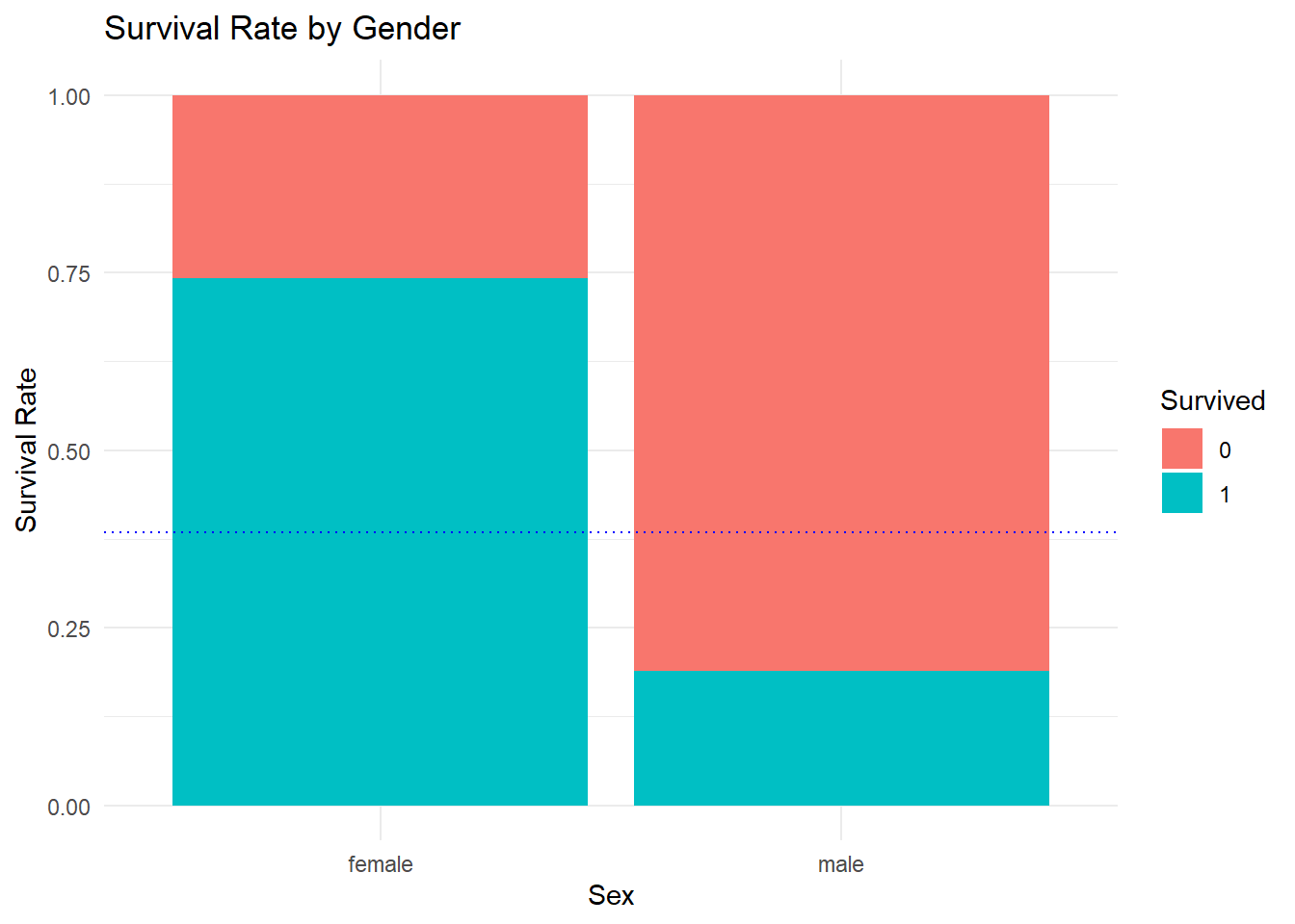 This indicates an improved model: if you were a female passenger, you survived, if you were a male one, you did not.
gender_solution <-
  test_titanic |>
  mutate(Survived = as.integer(Sex == "female"),
         .after = 1) |>
  dplyr::select(1:2)
gender_solution |> head() |> kable() |> kable_styling()| PassengerId | Survived |
|---|---|
| 892 | 0 |
| 893 | 1 |
| 894 | 0 |
| 895 | 0 |
| 896 | 1 |
| 897 | 0 |
20.0.1 What’s in a name?
Now consider the names of the passengers.
## # A tibble: 6 × 12
##   PassengerId Survived Pclass Name     Sex     Age SibSp Parch
##         <dbl>    <dbl>  <dbl> <chr>    <chr> <dbl> <dbl> <dbl>
## 1           1        0      3 Braund,… male     22     1     0
## 2           2        1      1 Cumings… fema…    38     1     0
## 3           3        1      3 Heikkin… fema…    26     0     0
## 4           4        1      1 Futrell… fema…    35     1     0
## 5           5        0      3 Allen, … male     35     0     0
## 6           6        0      3 Moran, … male     NA     0     0
## # ℹ 4 more variables: Ticket <chr>, Fare <dbl>, Cabin <chr>,
## #   Embarked <chr>
The format seems to be for male passengers: last name (surname), followed by a title (if they have one), followed by the first and middle name (if they have one). For women it is similar, but after a title such as Mrs. the name of the husband is given, followed by the woman’s name in parentheses afterwards.
There is a lot of information there, but begin by pulling out the title of the passenger. To do this, first skip until the first comma followed by a space, then the information desired comes before the next period. This can be done as follows.
titles <-
  train_titanic |>
  mutate(Title = str_replace(Name, "[^,]+, ([^\\.]+).+", "\\1")) |>
  dplyr::select(Survived, Title)
titles |> head()
## # A tibble: 6 × 2
## Survived Title
## <dbl> <chr>
## 1 0 Mr
## 2 1 Mrs
## 3 1 Miss
## 4 1 Mrs
## 5 0 Mr
## 6 0 MrTo see all the titles, count how many times each appears. The n function does just that, counting the number of rows. If this is applied after group_by, it counts the number of times each unique value appears.
## # A tibble: 17 × 2
##    Title        count
##    <chr>        <int>
##  1 Mr             517
##  2 Miss           182
##  3 Mrs            125
##  4 Master          40
##  5 Dr               7
##  6 Rev              6
##  7 Col              2
##  8 Major            2
##  9 Mlle             2
## 10 Capt             1
## 11 Don              1
## 12 Jonkheer         1
## 13 Lady             1
## 14 Mme              1
## 15 Ms               1
## 16 Sir              1
## 17 the Countess     1
The result is 19 different titles. Several just indicate gender, but others like Rev indicate profession, and some like Lady represent royalty. Consider collapsing these down by type of title.
titles2 <-
  titles |>
  mutate(Title = factor(Title)) |>
  mutate(Title =
    fct_collapse(Title,
      "Miss" = c("Mlle", "Ms"),
      "Mrs" = "Mme",
      "Ranked" = c( "Major", "Dr", "Capt", "Col", "Rev"),
      "Royalty" = c("Lady", "Dona", "the Countess", "Don", "Sir",
                    "Jonkheer")
    )
  )
## Warning: There was 1 warning in `mutate()`.
## ℹ In argument: `Title = fct_collapse(...)`.
## Caused by warning:
## ! Unknown levels in `f`: DonaNow the mean survival rate by title type can be computed.
## # A tibble: 6 × 2
##   Title   `mean(Survived, na.rm = TRUE)`
##   <fct>                            <dbl>
## 1 Ranked                           0.278
## 2 Royalty                          0.6
## 3 Master                           0.575
## 4 Miss                             0.703
## 5 Mrs                              0.794
## 6 Mr                               0.157
Again, a sharp difference, with Ranked and Mr titles falling short of the overall survival rate, while Royalty and Master were higher than a flip of the coin. The results for Miss and Mrs are unsurprising, given that these passengers are also all female.
20.1 Missing Data
Most datasets of any reasonable size will contain missing data, and this one is no exception. The map_dbl function can be used to find these values. This function requires a dataset as the first parameter, and a function to apply as the second. Here the sum of is.na is used to count the number of NA. The is.na function gets a period as a wildcard character inside the parentheses because it only takes a single argument. The ~ in front indicates that this is written using formula notation, a fast way of writing a function in R.
## PassengerId    Survived      Pclass        Name         Sex         Age
##           0           0           0           0           0         177
##       SibSp       Parch      Ticket        Fare       Cabin    Embarked
##           0           0           0           0         687           2
So every passenger has an ID, but not all have an Age, and quite a few do not have a Cabin number. That should not be too much of a problem as long as there is no attempt to build a model based on the Cabin number.
20.2 Ticket class
Speaking of ticket class, how do these survival rates vary from 1st to 3rd class passengers?
train_titanic |>
  ggplot(aes(x = Pclass, fill = factor(Survived))) +
    geom_bar(position = "fill") +
    theme_minimal() +
    ylab("Survival Rate") +
    labs(fill = "Survived") +
    geom_hline(yintercept = 0.3838, col = "blue", lty = 2) +
    ggtitle("Survival Rates by Passenger Class")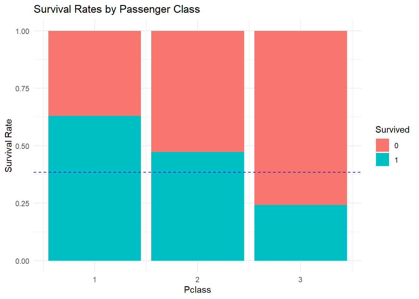
It should be clear that being in first class was beneficial to survival. Note that in the plot the abbreviation lty = 2 was used instead of linetype = "dotted" this time.
20.3 Fare
The class of the passenger is a discrete variable, and does not actually contain as much information as the fare that the passenger paid for their ticket. Even among first class passengers, there are differences in the prices of tickets. So does that do better? Recall that a density plot can be used with numerical values.
train_titanic |>
  ggplot(aes(x = Fare, fill = factor(Survived))) +
    geom_density(alpha = 0.4) +
    ggtitle("Density Plot of Fare related to Survival")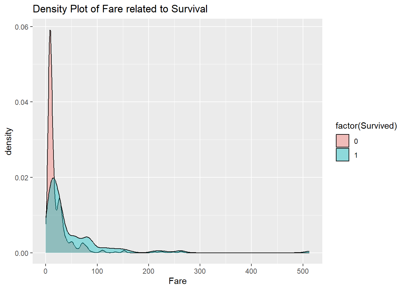
The fares go way out to the right in this dataset. This type of behavior is emblematic of heavy-tailed data. The price of a first class ticket can be an order of magnitude higher than that of a typical third class ticket. This type of behavior is in contrast to light-tailed data such as that coming from the normal distribution.
Heavy-tailed data arises when the thing being measured tends to grow by multiplication rather than addition. For instance, a price might increase by 1% or 2% or 3%. That is equivalent to multiplying by either 1.01, 1.02, or 1.03.
To deal with this, take the natural logarithm of the data. Taking the log turns multiplication into addition, and this makes the data light-tailed again.
train_titanic |>
  ggplot(aes(x = log(Fare), fill = factor(Survived))) +
    geom_density(alpha = 0.4) +
    ggtitle("Density Plot of Fare related to Survival")
## Warning: Removed 15 rows containing non-finite outside the scale
## range (`stat_density()`).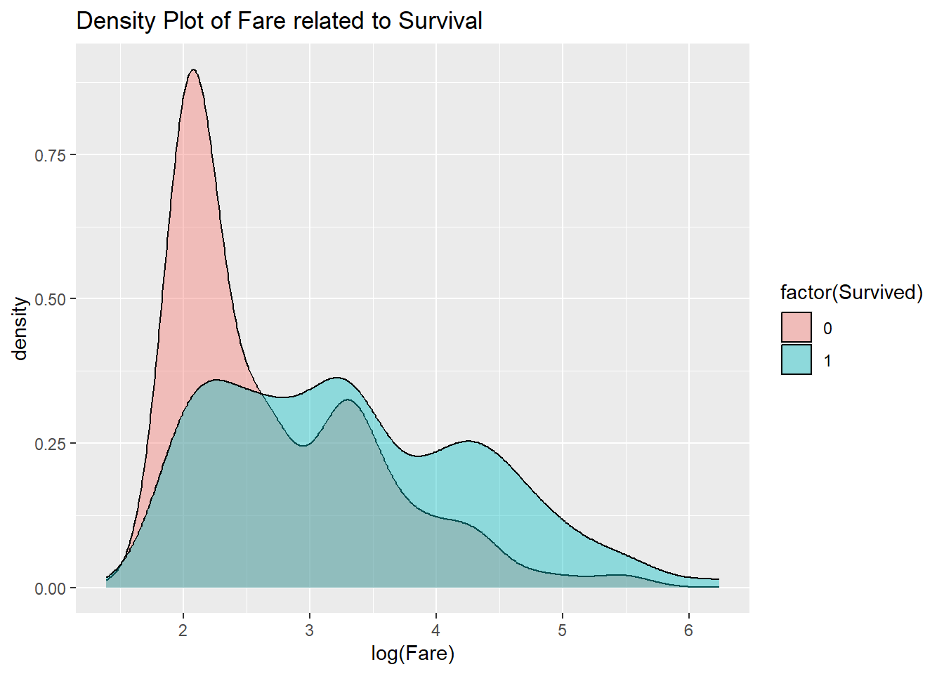
Now it is clear that higher Fares ended up increasing survival.
20.4 Age
A similar plot could be made for the age variable. Because the largest Age value for humans is bounded, there is no way that the data can be heavy-tailed, so the log is not needed.
train_titanic |>
  ggplot(aes(x = Age, fill = factor(Survived))) +
    geom_density(alpha = 0.4) +
    ggtitle("Density Plot of Fare related to Survival")
## Warning: Removed 177 rows containing non-finite outside the scale
## range (`stat_density()`).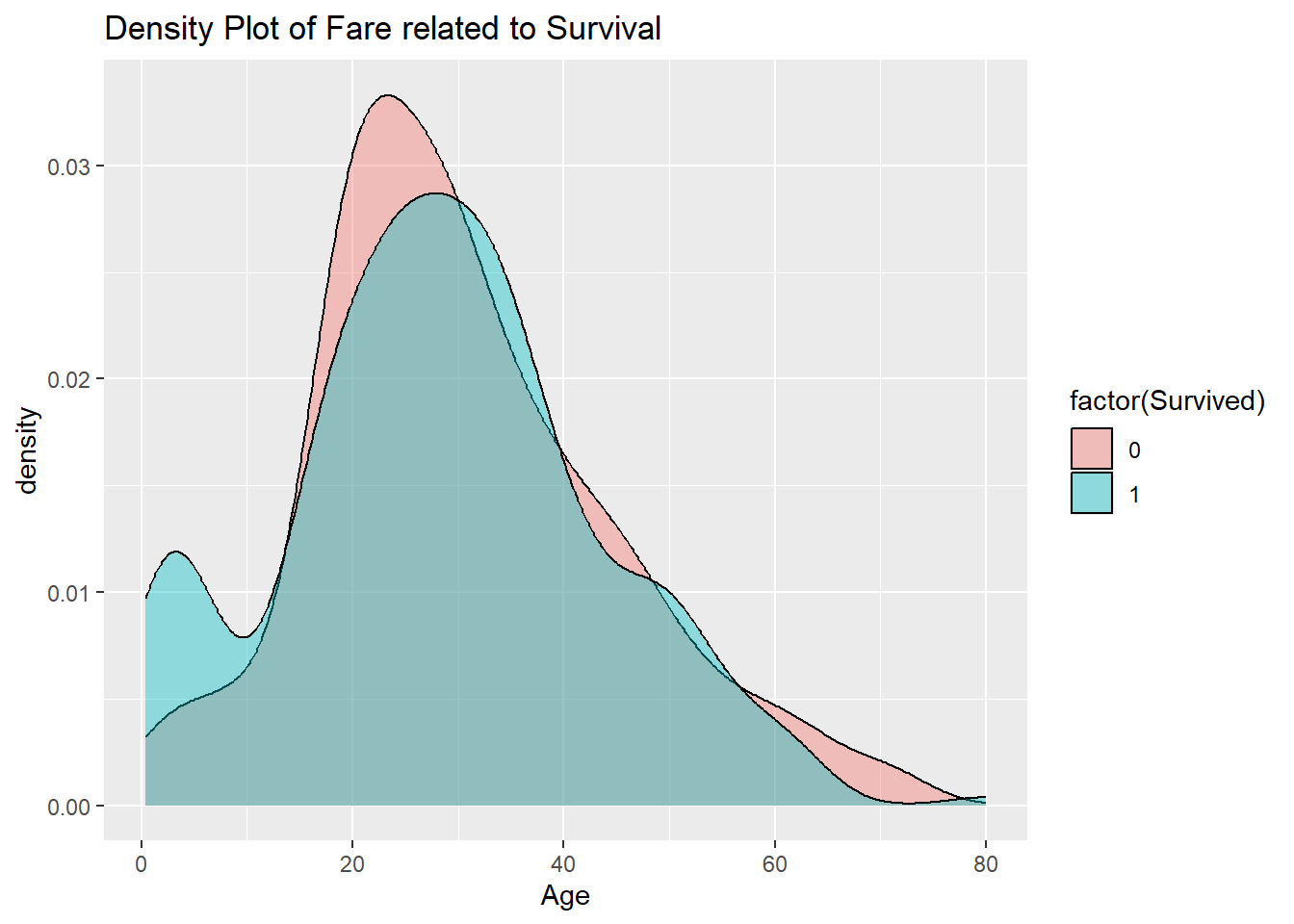
20.5 Building a model
Now that the EDA has shown what variables might be of interest in prediction, it is time to construct a model. These predictors include both categorical and numerical data. For this type of mixed data, a conditional inference tree. This type of tree works by branching, essentially breaking the predictor variable space into two pieces, and recursively working on each piece to find breaking points that aid in predicting the response.
For this problem, a branch might be on passenger class, or gender. The tree uses nonparametric statistical tests in order to decide which factor to split the space on next.
To illustrate this, the cforest function from the partykit will be used to construct the tree.
This function makes some random choices in deciding where to break. Normally this is an advantage, as it is not tuned to any one dataset. However, here in order to ensure that the same model is produced each time, the seed of the random number generator is set to a fixed value.
Now for the construction of the tree. The first argument to cforest is the statistical model (the response, a ~, and the predictors separated by + signs), and the second is the dataset. Because the dataset does not come first, pipes cannot be used for this function.
Unlike most of the functions used so far, cforest can take a long time to run. But once built, the model is quick to execute.
Use the functions from the modelr to test it.
Take a look at how the predictions compare to the original data. Recall that add_predictions by default puts the predictions in a variable called pred.
## # A tibble: 891 × 2
##    Survived   pred
##       <dbl>  <dbl>
##  1        0 0.0968
##  2        1 0.210
##  3        1 0.475
##  4        1 0.750
##  5        0 0.123
##  6        0 0.146
##  7        0 0.465
##  8        0 0.306
##  9        1 0.607
## 10        1 0.692
## # ℹ 881 more rows
This is a problem! Because Survived used 0 and 1, the predictions made thought a continuous output was appropriate. However, the goal is to get 0 or 1 answers. One way to do this is just by rounding up past a threshold and down below a threshold. A better way is to make sure that Survived is set up as a factor before doing the conditional inference forest. The functions mutate and factor can be used to accomplish this.
Now work off of this factor version of the data.
Now build predictions for this model.
Now pull out the Survived and pred variables.
## # A tibble: 891 × 2
##    Survived pred
##       <dbl> <fct>
##  1        0 0
##  2        1 0
##  3        1 0
##  4        1 1
##  5        0 0
##  6        0 0
##  7        0 0
##  8        0 0
##  9        1 1
## 10        1 1
## # ℹ 881 more rows
The first few rows look accurate, and it is easy to check all the training data.
## # A tibble: 1 × 1
##   `mean(Survived == pred)`
##                      <dbl>
## 1                    0.750
So that is interesting! Just by including the knowledge of the Fare, the model was able to predict correctly about 75.0% of the time on the training data. Now add a few more predictors.
Now to check the results.
## # A tibble: 1 × 1
##   `mean(Survived == pred)`
##                      <dbl>
## 1                    0.852
Nice! Adding these factors in has improved the performance to about 85.2%.
In the EDA, the title of the person seemed to be a helpful predictor. To see if that holds, a modified version of the dataset needs to be created.
train2 <-
  train1 |>
    mutate(Title = str_replace(Name, "[^,]+, ([^\\.]+).+", "\\1")) |>
    mutate(Title = factor(Title)) |>
    mutate(Title =
      fct_collapse(Title,
        "Miss" = c("Mlle", "Ms"),
        "Mrs" = "Mme",
        "Ranked" = c( "Major", "Dr", "Capt", "Col", "Rev"),
        "Royalty" = c("Lady", "the Countess", "Don", "Sir","Jonkheer")
      )
)Now to check the results.
## # A tibble: 1 × 1
##   `mean(Survived == pred)`
##                      <dbl>
## 1                    0.857
Not much improvement, but up to 85.7%. This indicates that Title does not give much information about survival that was not already gleaned from the other predictor variables.
20.6 Using the model on the test data
Any model formed from the training data will be used for predictions for the test data.
So start by doing what was done to the training data to the test data. This can be done by combining the training and test data with a full join. This ensures that all the variables from both data sets are included. Then add the Title information for both sets. A new title appears called “Dona” which is a Spanish royalty honorific.
titanic <-
    full_join(train_titanic, test_titanic) |>
    mutate(Title = str_replace(Name, "[^,]+, ([^\\.]+).+", "\\1")) |>
    mutate(Title = factor(Title)) |>
    mutate(Title =
      fct_collapse(Title,
        "Miss" = c("Mlle", "Ms"),
        "Mrs" = "Mme",
        "Ranked" = c( "Major", "Dr", "Capt", "Col", "Rev"),
        "Royalty" = c("Lady", "the Countess", "Don", "Dona", "Sir","Jonkheer")
      )
    ) |>
    mutate(sur_factor = factor(Survived))
## Joining with `by = join_by(PassengerId, Pclass, Name, Sex,
## Age, SibSp, Parch, Ticket, Fare, Cabin, Embarked)`Now use our last model to make predictions. The variable Survived is just all NA, so can be removed.
test_pred <-
  titanic |>
  filter(is.na(sur_factor)) |>
  dplyr::select(-Survived) |>
  add_predictions(cf_model4)
Now keep just the predictions.
cf_model4_solution <-
  test_pred |>
  dplyr::select(PassengerId, Survived = pred)
cf_model4_solution |> head()
## # A tibble: 6 × 2
## PassengerId Survived
## <dbl> <fct>
## 1 892 0
## 2 893 0
## 3 894 0
## 4 895 0
## 5 896 1
## 6 897 0Write this out as a comma separated file.
When submitted to Kaggle, this model returns a score of 76.3%. Not nearly as good as when run on the training data. In fact, most models will be worse on the test data. After all, the parameters were fine-tuned to match the training data as best as possible, so it is no surprise that a dataset from the wild behaves slightly differently.
20.7 Considerations
There are always two goals for models.
Accuracy One goal is for the model to be good at prediction.
Simplicity A temptation is to throw everything into a model in the hopes of doing as well as possible.
Keeping things simple means not using all available data as predictors. This in the end can actually help with the first goal. An overfitted model might end up less accurate on the test data than the original training data.
How can it be determined if the model is overfitted? It is not easy. There are statistical tests that can be used, but essentially it boils down to experience and awareness that a model should be only as complex as it needs to be to capture the features of the data you are interested in.
Another thing to keep in mind: these models only give predictions through correlation. Typically they do not say that the variables cause the left hand side to be the value it is. In the Titanic model, there are social reasons why someone with a first class ticket might be more likely to survive. So that is why it is important when working with data from a domain (such as economics, medicine, or sociology) to have some knowledge of how the domain works in order to understand what is causing what in our models.