6 Graphical Grammars
Summary
An important part of the tidyverse is the ggplot2 package, which includes commands for a grammar of graphics.
The grammar of graphics uses the ggplot function to create a canvas upon which we will place graphical elements in layers.
Use
+to add a layer/graphical element/transformation to an existing graphical object.Various functions that start with geom_ then are used to place various graphical elements on the canvas.
Important geometries include
geom_pointfor making scatterplots,geom_barfor bar graphs, andgeom_smoothfor creating lines and curves to fit data.The
aes(aesthetic) function is used to create a mapping that tells a geometry how to translate data into needed values.Functions that start with coord_ can be used to stretch coordinates or flip the horizontal and vertical axes.
Functions that start with theme_ can be used to change the overall look of a graph.
Grouping can be done by
color,shape, andsizewithin an aesthetic.Grouping can also be done by dividing the graph into multiple graphs using
facet_layers.The parameter
fillis used to fill colors inside an object (like a bar or polygon) whilecolorcolors the outside of objects. (Note that a point in a scatterplot is all outside with no interior.)Maps can be drawn using
geom_polygon. Latitude and longitude can be correctly scaled toxandyusingcoord_quickmap.
It is important to have data in tidy form. This has been shown with the functions of dplyr like select and filter. But the real power of tidy data is that it works across packages.
Here a package for visualization of data, ggplot2, is introduced. Like dplyr, this package assumes that the data is already in tidy form. With that form, the ability to create new and useful plots to help understand the data is unparalleled.
The gg in ggplot2 stands for graphical grammar. Just like using verbs, nouns, and connectors, an infinite number of sentences can be built from basic words in a language, using the basic tools of ggplot2, and infinite number of plots can be built by describing what the plot should contain and how it should present the data.
A grammar of graphics is a set of tools for building graphics by adding components and transformations layer by layer.
This chapter will use the tidyverse.
Consider a data set built into R called iris. This dataset measures the sepal and petal length (in cm) of three species of iris found in Canada and Alaska.
##   Sepal.Length Sepal.Width Petal.Length Petal.Width Species
## 1          5.1         3.5          1.4         0.2  setosa
## 2          4.9         3.0          1.4         0.2  setosa
## 3          4.7         3.2          1.3         0.2  setosa
## 4          4.6         3.1          1.5         0.2  setosa
## 5          5.0         3.6          1.4         0.2  setosa
## 6          5.4         3.9          1.7         0.4  setosa
The unique function can be used to pick out the names of the species.
##        Species
## 1       setosa
## 51  versicolor
## 101  virginica
Consider the following command:

It looks like a blank slate, which is exactly what it is. The function ggplot sets up the graphics, but does not create any on its own. To do that, the plus sign + can be used to add geometries that come from data.
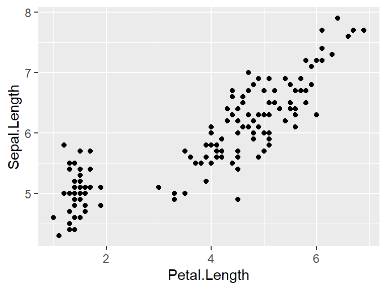
The first type of data plot that will be shown is a scatterplot. In this type of plot, points are added to the plot in such a way that their horizontal x-coordinate is one variable, and the vertical y-coordinate is another variable. For instance, to see petal length on the horizontal axis and sepal length on the vertical axis, use the following code.
6.0.1 Aesthetic mappings
The geom_point function begins with geom_, as do all of the geometry functions. Note that the first parameter to geom_point has to be an aesthetic data type. This type of variable is created using the aes function, which transforms the dataset into a visual representation.
For geom_point, aes has two parameters, x for the name of the variable that goes on the horizontal axis, and y for the name of the variable that goes on the vertical axis.
Aesthetic mappings describe how variables in the data are mapped to visual properties.
6.0.2 Themes
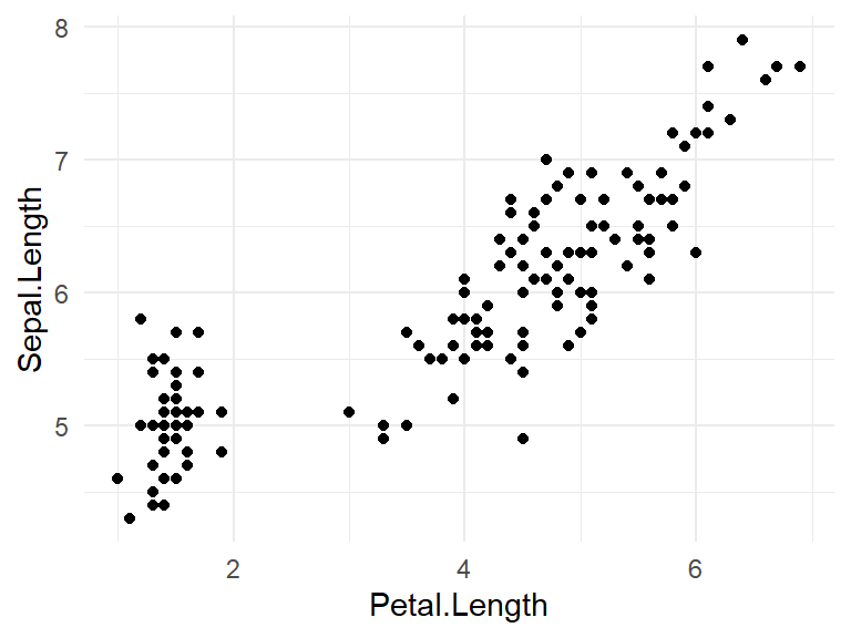
Once the data is plotted, theme_ functions can be used to modify the background, making it more suitable for a .pdf or .html file. For instance, the theme_minimal function removes the gray square background that appears by default.
6.1 Labels
With a graph, labels can be added as well.
iris |>
  ggplot() +
geom_point(aes(x = Petal.Length, y = Sepal.Length)) +
theme_minimal() +
ggtitle("Anderson's Iris Data") +
xlab("Petal Length (cm)") +
ylab("Sepal Length (cm)")
6.2 Coordinate transformations
There are also coordinate transformations and start with coord_. For instance, to swap the horizontal and vertical axes in a plot, use coord_flip.
iris |>
  ggplot() +
  geom_point(aes(x = Petal.Length, y = Sepal.Length)) +
theme_minimal() +
ggtitle("Anderson's Iris Data") +
xlab("Petal Length (cm)") +
ylab("Sepal Length (cm)") +
coord_flip()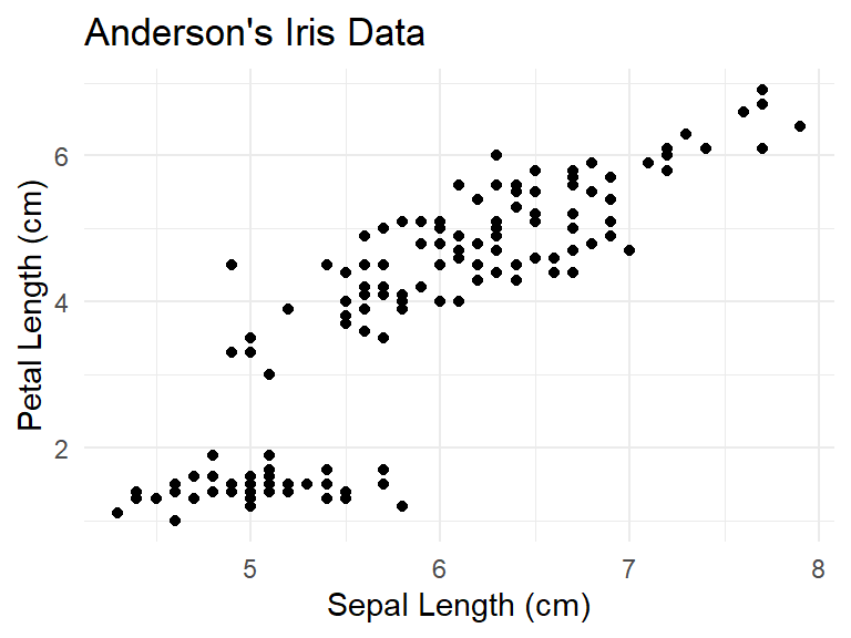
6.3 Overview of creating a plot
So to create a plot:
Start with the ggplot function.
Use the plus sign to add a geometry, a theme, and/or label adjustments as needed.
This is why this is called a graphical grammar. Like a grammar for a language like English, you can put together words to make more complicated sentences. In the same way, geometries, coordinate transformations, and themes can be added to a ggplot to make a fairly complicated object.
6.4 Clusters of points
Consider again the scatterplot of sepal length versus petal length.
iris |>
  ggplot() +
  geom_point(aes(x = Petal.Length, y = Sepal.Length)) +
  theme_minimal() +
  ggtitle("Anderson's Iris Data") +
  xlab("Petal Length (cm)") +
  ylab("Sepal Length (cm)")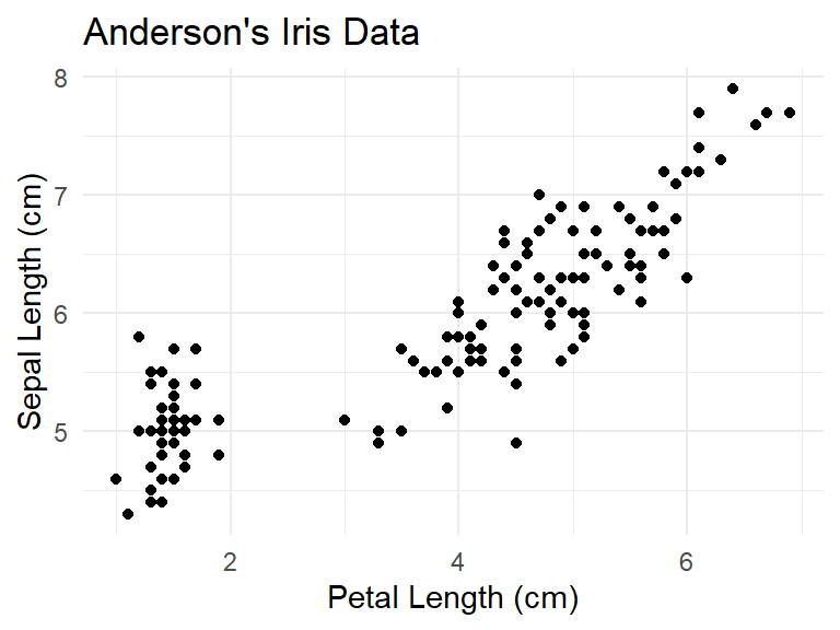
Several of the dots appear to be off to the side away from the others. This is often called a cluster of points. Can this clustering be explained by the species of the observation? In order to determine this, it is necessary to have a way to see which point/observation corresponds to which species.
One way to do this is with the color of the point. Because the color of the point is changing based on a value of a variable in the data, this will go inside the aes function.
iris |>
  ggplot() +
  geom_point(aes(x = Petal.Length, y = Sepal.Length,
                 color = Species)) +
  theme_minimal() +
  ggtitle("Anderson's Iris Data") +
  xlab("Petal Length (cm)") +
  ylab("Sepal Length (cm)")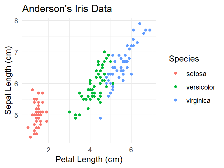
Seeing the colors makes the three clusters of species points clear. Unfortunately, not everyone can see different colors. The shape of the point can also be adjusted.
iris |>
  ggplot() +
  geom_point(aes(x = Petal.Length, y = Sepal.Length,
                 color = Species, shape = Species)) +
  theme_minimal() +
  ggtitle("Anderson's Iris Data") +
  xlab("Petal Length (cm)") +
  ylab("Sepal Length (cm)")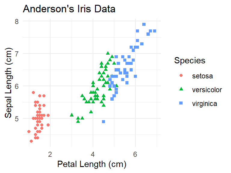
There are quite a few different geometries and aesthetics that can be built in ggplot. We will get a feel for this using a variable mpg that is part of the ggplot2 package.
Like the built in data sets in R, use ?mpg to bring up the help for the data set. This help reveals that this data set contains mileage information on 234 cars from 38 models spanning 1999 to 2008.
| manufacturer | model | displ | year | cyl | trans | drv | cty | hwy | fl | class |
|---|---|---|---|---|---|---|---|---|---|---|
| audi | a4 | 1.8 | 1999 | 4 | auto(l5) | f | 18 | 29 | p | compact |
| audi | a4 | 1.8 | 1999 | 4 | manual(m5) | f | 21 | 29 | p | compact |
| audi | a4 | 2.0 | 2008 | 4 | manual(m6) | f | 20 | 31 | p | compact |
| audi | a4 | 2.0 | 2008 | 4 | auto(av) | f | 21 | 30 | p | compact |
| audi | a4 | 2.8 | 1999 | 6 | auto(l5) | f | 16 | 26 | p | compact |
| audi | a4 | 2.8 | 1999 | 6 | manual(m5) | f | 18 | 26 | p | compact |
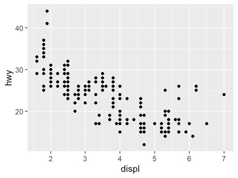
Consider the same plot from earlier for the mpg data set, plotting highway mileage (hwy) versus displacement (displ).

From the data, we see that as the displacement of the engine (essentially the engine size) grows, the highway mileage tends to go down.
However, there is a weird exception among the points. Most of the data clumps together in the same spot, but there are some data points near the right hand side that seem higher than the main body of points. Perhaps those points represent a special type of car? To add that dimension of the data to the graph, We will use color to show the class of the car.
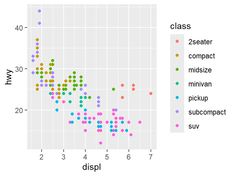
With the colors in place, it becomes clear that the points that are off from the rest mostly belong to 2-seater cars.
There are lots of choices beyond color here. For instance, the size of the points can be used to denote the class.
## Warning: Using size for a discrete variable is not advised.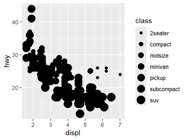
Note that our code has sparked a warning: Using size for a discrete variable is not advised. In fact, looking at the graph reveals that the warning was pretty smart. It is very difficult to tell what class a point is by shape, and it causes lots of overlap between points.
The shape of the points can be changed by the class.
## Warning: The shape palette can deal with a maximum of 6 discrete
## values because more than 6 becomes difficult to
## discriminate
## ℹ you have requested 7 values. Consider specifying shapes
## manually if you need that many of them.## Warning: Removed 62 rows containing missing values or values
## outside the scale range (`geom_point()`).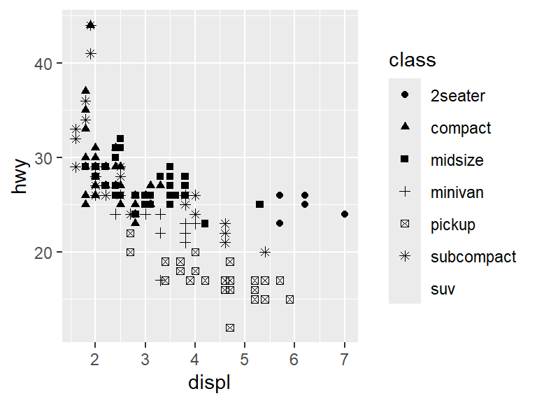
This provokes another warning. In this case the data has seven classes, but there are only six shapes so the SUV class does not get a shape.
It is possible to change all the points to the same color.
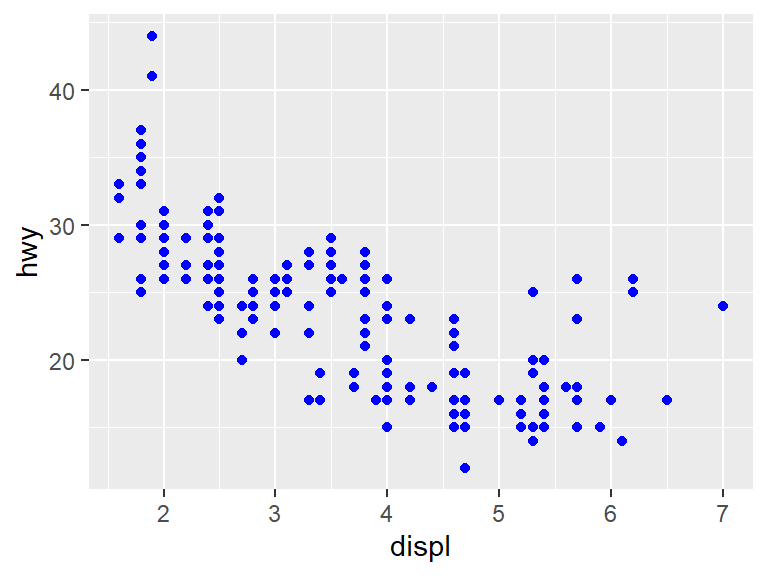
Note that the color parameter is outside of the aes. If the color should depend on the data, it needs to go inside the aes. But since this just colors all data points blue, it becomes part of a parameter color directly for geom_point, and not for aes.
6.5 Facets
Previously color, size, and shape were used to tell the different points apart. It is also possible to break the plot into multiple plots using facets.
For instance, the facet_wrap function can break data into groups based on a predictor variable. In statistics, the notation ~ predictor_variable tells us that the variable to the right of the ~ sign is being used to predict something. In the case of a graph, this will split the graph into a different graph for each value of the predictor. To split on the variable class, use:
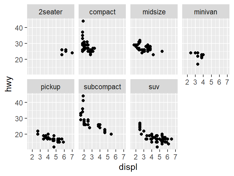
By using facet_wrap, the plot is split into multiple windows (facets) based on the class of the vehicle.
6.6 Using multiple geometries
A geom is a geometric object, it represents a way of looking at data. In the last chapter, the geom_point was used for data. Here each \(x\) and \(y\) value was represented by a small black dot. This is also known as a scatterplot.
In a scatterplot two variables (often called \(x\) and \(y\)) are chosen, and then a point is placed for each observation in the dataset at coordinate \((x, y)\).
The points could be replaced by a smooth line geom that attempts to predict the position of the points with the geom_smooth geometry.
## `geom_smooth()` using method = 'loess' and formula = 'y ~
## x'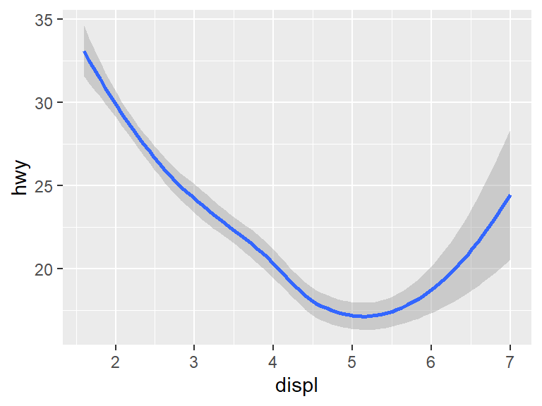
Both the points and the line used a mapping argument, but not every aesthetic works with every geom. For instance, the shape aesthetic works with points, but not with lines. The linetype aesthetic works with lines, but not with points.
Unfortunately, having put the prediction down with geom_smooth, the points are gone. This is where the power of using a grammar of graphics comes into play. It is very easy to show both the points and the prediction using the + sign.
ggplot(data = mpg) +
geom_point(mapping = aes(x = displ, y = hwy)) +
geom_smooth(mapping = aes(x = displ, y = hwy))## `geom_smooth()` using method = 'loess' and formula = 'y ~
## x'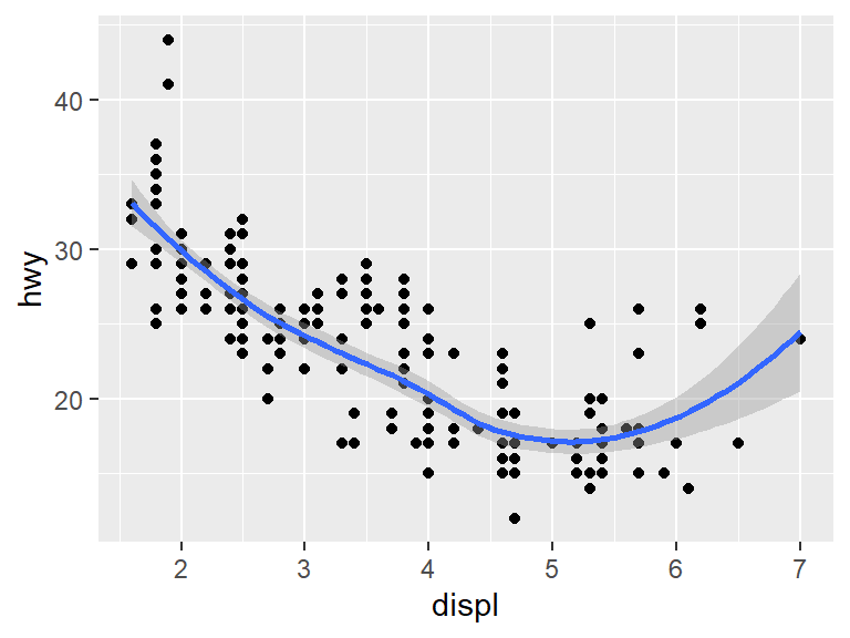
Because both geom_ functions used the same aesthetic, the aesthetic could be placed into the initial ggplot without changing the plot.
## `geom_smooth()` using method = 'loess' and formula = 'y ~
## x'
For the above code, say that geom_point and geom_smooth inherits the aesthetic.
As with the point geoms, we can break down the lines into different classes. For instance, if we break the data into three groups by the type of drive the cars use, we get something like this.
## `geom_smooth()` using method = 'loess' and formula = 'y ~
## x'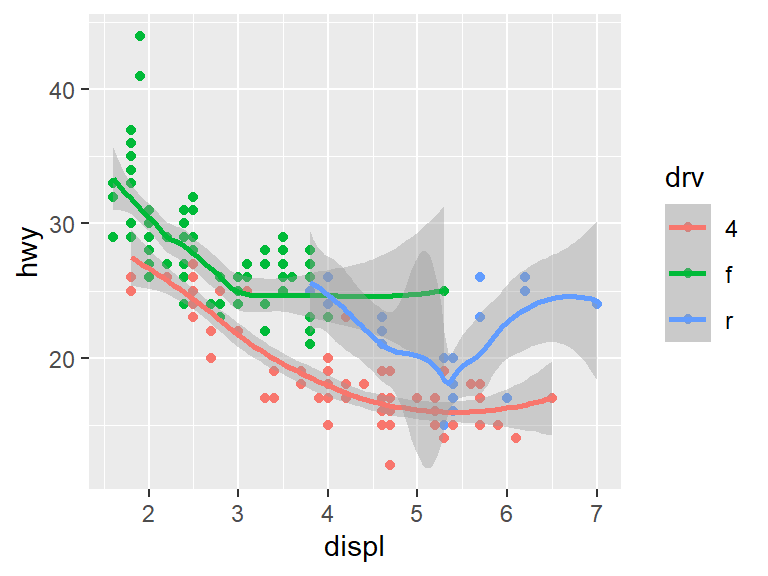
Different aesthetics can be used for different geoms. For instance, we can color the points by car class and leave the line geom as blue.
ggplot(data = mpg, mapping = aes(x = displ, y = hwy)) +
  geom_point(mapping = aes(color = class)) +
  geom_smooth()
## `geom_smooth()` using method = 'loess' and formula = 'y ~
## x'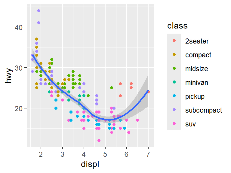
6.7 Bar charts
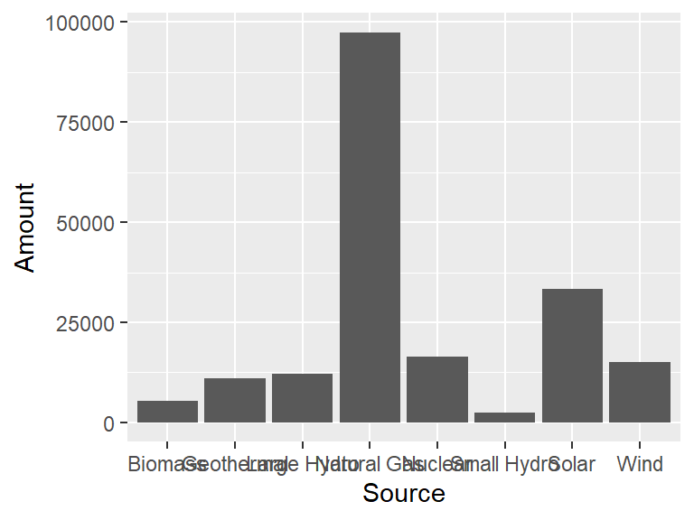
Another type of geom is geom_bar, which creates a bar chart.
Consider the following data set, which holds the different sources of energy that were above 1000 GWh used in California in 2019.
CA_energy <- tribble(
  ~Source, ~Amount,
  "Natural Gas", 97431,
  "Nuclear", 16477,
  "Large Hydro", 12036,
  "Biomass", 5381,
  "Geothermal", 11116,
  "Small Hydro", 2531,
  "Solar", 33260,
  "Wind", 15173
)
To visualize this with a bar graph, the geom_bar can be used. The height of each bar will be the Amount value, and there will be a bar for each Source.
To change the color of the bars, there are two parameters, color which changes the outside of the bar, and fill which changes the interior. Consider the following.
ggplot(CA_energy) +
  geom_bar(aes(x = Source, y = Amount),
           stat  = "identity",
           color = "white",
           fill  = "blue")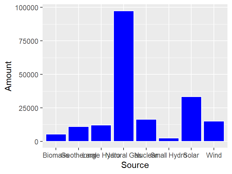
Something that often happens with these type of plots is that the labels for the bars are too big to not overlap. The easiest way to deal with this is to flip the horizontal and vertical axes with coord_flip.
ggplot(CA_energy) +
  geom_bar(aes(x = Source, y = Amount),
           stat = "identity",
           color = "white",
           fill  = "blue") +
  coord_flip()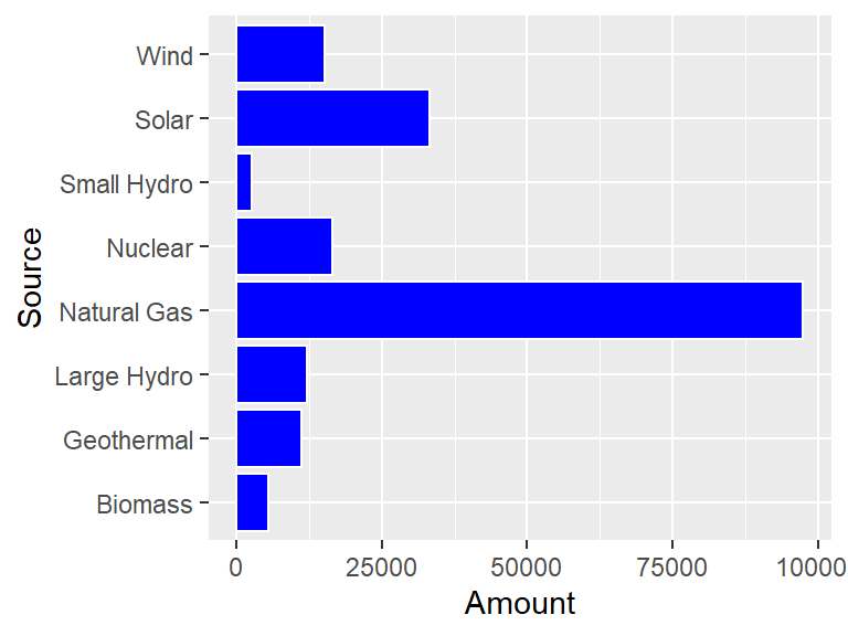
Okay, but now the 100000 number is getting cut off so that it looks like 10000! To solve this problem, use scale_y_continuous to give a little bit of extra space to the plot.
ggplot(CA_energy) +
  geom_bar(aes(x = Source, y = Amount),
           stat = "identity",
           color = "white",
           fill  = "blue") +
  coord_flip() +
  scale_y_continuous(limits = c(0, 101000))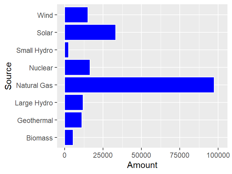
Nice, but it would look even better if the bars were ordered from long to short. The reorder helper function can be used to order the Source names to make this happen.
ggplot(CA_energy) +
  geom_bar(aes(x = reorder(Source, Amount), y = Amount),
           stat  = "identity",
           color = "white",
           fill  = "blue") +
  coord_flip() +
  scale_y_continuous(limits = c(0, 101000))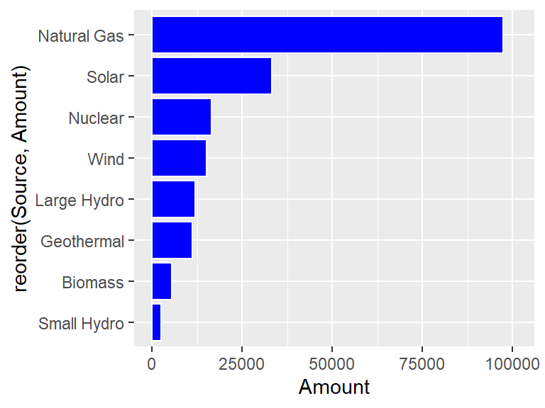
Unfortunately, using reorder(Source, Amount) makes that expression the label of the x-axis (which is now the vertical axis!) The xlab function can fix this.
ggplot(CA_energy) +
  geom_bar(aes(x = reorder(Source, Amount), y = Amount),
           stat  = "identity",
           color = "white",
           fill  = "blue") +
  coord_flip() +
  xlab("Source")  +
  scale_y_continuous(limits = c(0, 101000))
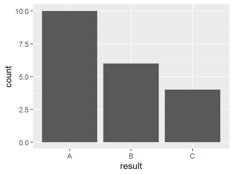
6.8 Counting to make bar charts
Another type of dataset might survey a group of individuals and return one of three answers, A, B, or C. Each person was also asked if they live in town (coded I) or out of town (coded O). For instance, the first twenty people surveyed might have the following result.
count_example <- tibble(
  n        = 1:20,
  result   = c("B", "A", "A", "A", "A", "C", "B", "A", "B", "A",
               "A", "C", "C", "A", "B", "B", "A", "B", "A", "C"),
  location = c("I", "O", "I", "I", "I", "O", "I", "O", "I", "I",
               "O", "I", "I", "O", "I", "I", "I", "O", "I", "O")
)
The default statistic for geom_bar is called "count", and this just counts the number of times each outcome appears. For such a statistic, there is only a need to give one parameter to aes, which is the variable whose outcome is being counted.
It might make a difference to the samplers whether or not the person being surveyed lives in or out of town. The color of the bars as set by fill can be used to differentiate.
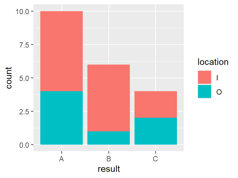
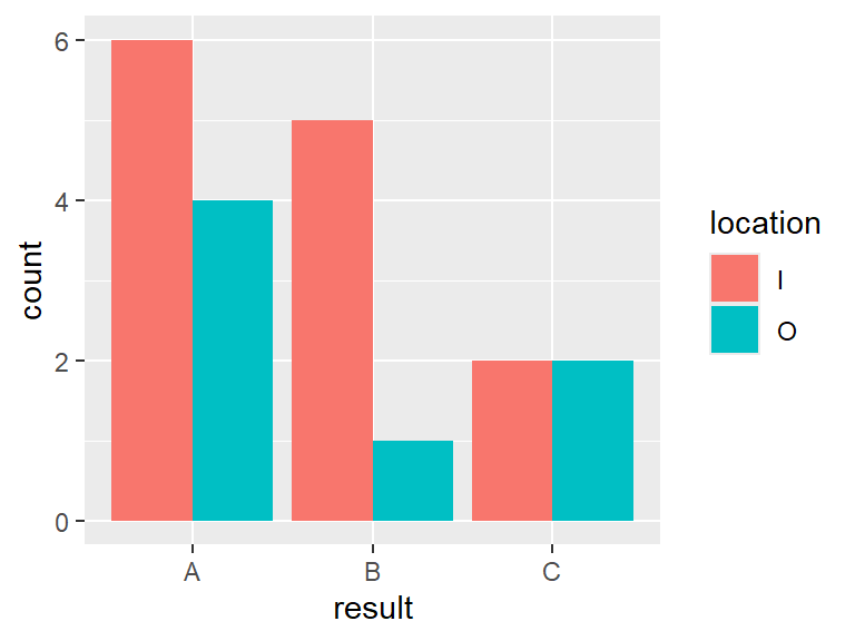
In this case the bars were broken down into color based on whether or not the respondent lived in or out of town. To see the bars side by side, set position = "dodge" in geom_bar.
6.9 Making maps
Spatial data often occurs over regions. For instance, consider a dataset containing the location of the nuclear power plant in California.
Suppose that the goal is to make a plot of the state of California with this location marked. Then the maps can be used to do this.
A function within this package, map_data contains latitude and longitude points for all fifty states as well as the U.S. as a whole.
The geom_polygon can then be used with this information to build a map.
ggplot() +
  geom_polygon(data = ca, aes(x = long, y = lat),
               fill = "yellow", color = "black")  +
  geom_point(data = CA_nuclear, aes(x = lon, y = lat), color = "blue", size = 2)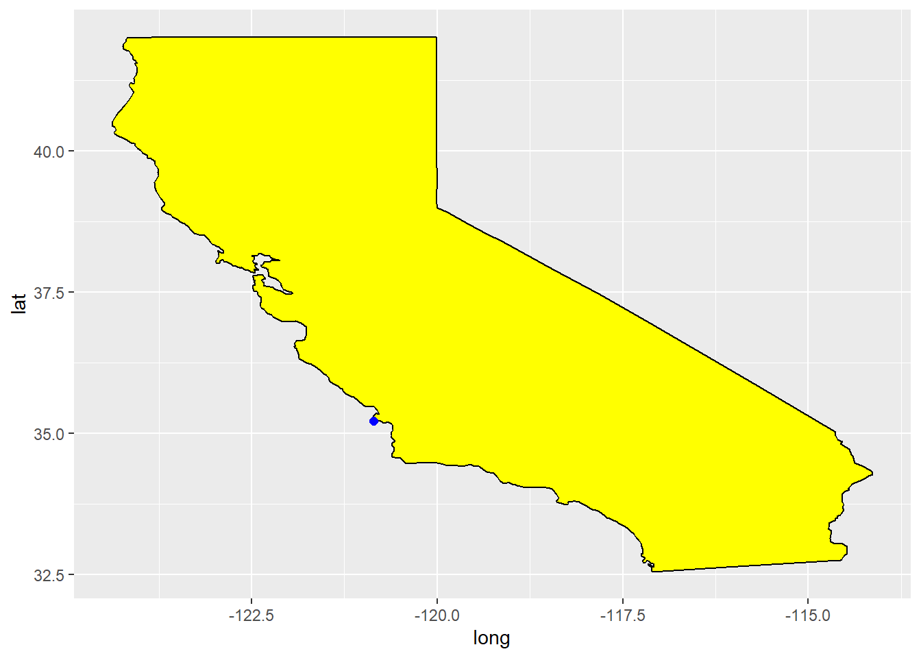
There is a problem though, things seem strangely stretched out. That is because latitude and longitude are spherical coordinates, and so do not map directly to rectangular coordinates. The solution is to use coord_quickmap, which is designed to stretch things in just the right way to compensate for this effect.
ggplot() +
  geom_polygon(data = ca, aes(x = long, y = lat),
               fill = "yellow", color = "black")  +
  geom_point(data = CA_nuclear, aes(x = lon, y = lat),
             color = "blue", size = 2) +
  coord_quickmap()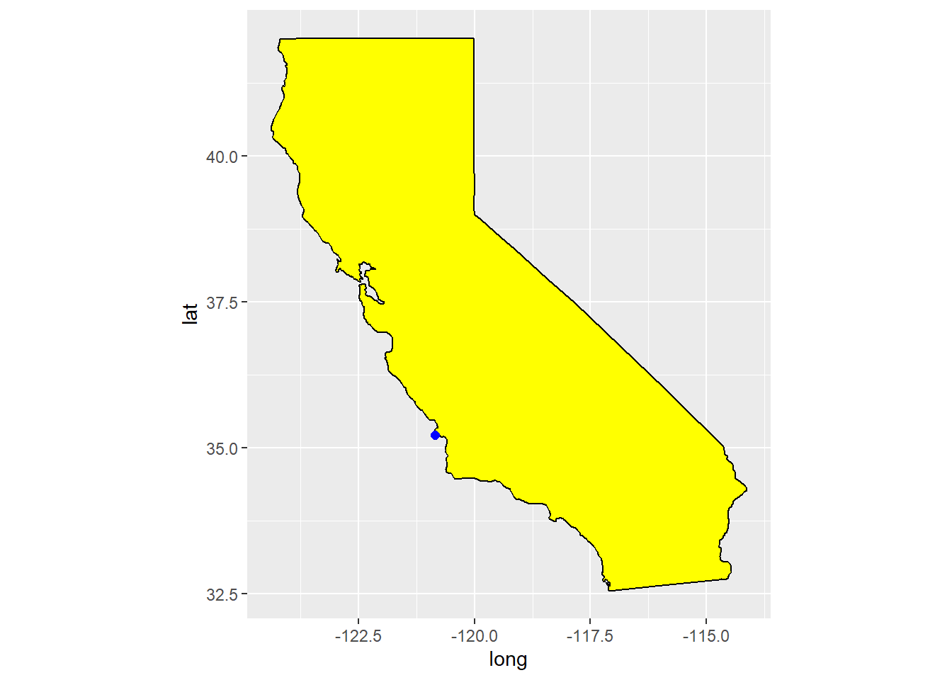
Questions
What function do you use to draw a blank canvas in the tidyverse?
What function do you use to add a set of points to a canvas?
What function do you use to add points connected by lines to a canvas?
Consider the built in data set USArrests.
- Using the help, what does the variable
Assaultmeasure in the data set? - Create a scatterplot of Murder arrests versus Assault arrests.
- Add a loess line to your scatterplot.
Consider the built in data set ToothGrowth in R.
- Create a scatterplot of tooth length versus dose.
- Add a loess line to your scatterplot that is colored green. (Note you do not have to print out your homework in color.)
Plot a map of the state of Iowa using the correct aspect ratio.
Consider the cars data set that is built into R.
Create a new data set based on
carsthat has a columnratiothat is the ratio between the speed of the car and the stopping distance of the car.Create a scatter plot of
ratioversusspeed.Add a least squares line fit to the plot.
Consider the following tibble
If we plot this tibble using geom_line, the default axis values are set automatically by default.
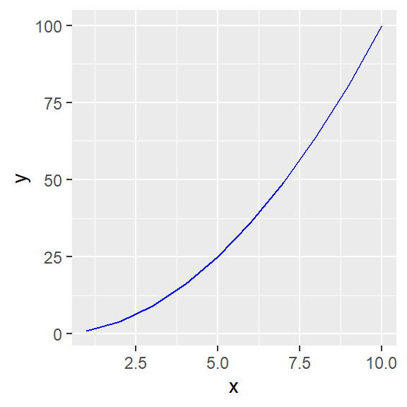
Use the
coord_cartesianfunction to restrict the y values from 10 to 50.In the previous part the
ylimparameter inside thecoord_cartesianfunction was used to set the limits. It turns out that [ggplot2]{class=PackageName] has a separate function also called ylim. Use?ylimto see help and some examples. In this part, use theylimfunction to restrict the y values from 10 to 50 in your plot.
Consider the following plot, which creates a bar plot, and then puts the number above the bars.
df <- enframe(c(30,15,5))
ggplot(df, aes(x = name, y = value)) +
  geom_bar(stat = "identity") +
  geom_text(aes(label = value), vjust = -1)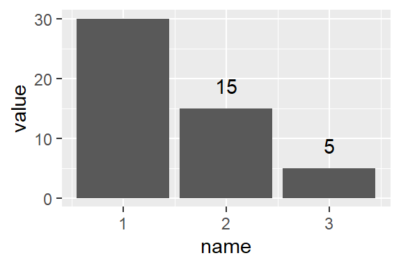
Change the y limits so that the label above the first bar is not cut off.
Consider the starwars data set from the dplyr package. A boxplot gives a way of seeing where the bulk of values for a variable lie. The line in the middle of the box is the sample median, and the width of the box depends on the spread in the variable. Points outside the box indicate outliers, values very far away from the center.
Create a boxplot of character height versus gender using geom_boxplot.
Which gender tends to have a larger height, male or female.
Which has greater variation, male or female?