Article Response
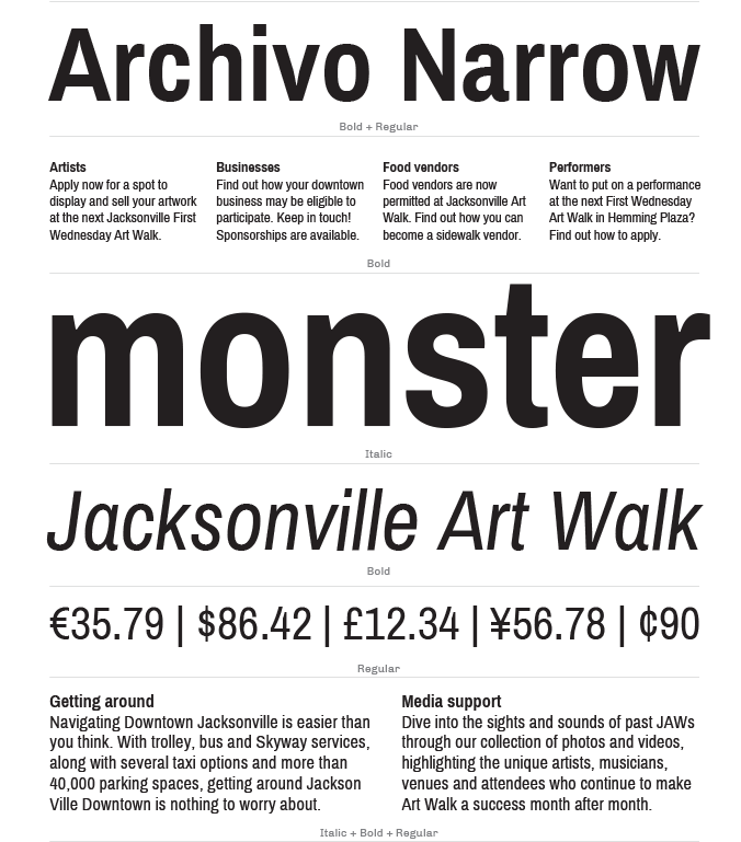
"Archivo Narrow was designed by Héctor Gatti and Omnibus-Type Team. The purpose of this typeface is multi-functionality across both print and digital platforms, though it was originally designed for highlights and headlines. This font family is similar to those of late nineteenth century American typefaces. Personally I enjoy the design of this typeface. It is easy to read and it’s true to it’s purpose as headlines in it’s font look great. The only thing I dislike about the font is when using the style Narrow Italic, some letters appear to be a bit close to one another, making it a little difficult to read. Overall, I would use this font family in my website designs."

Research for this article came from Omnibus.com