Article Response
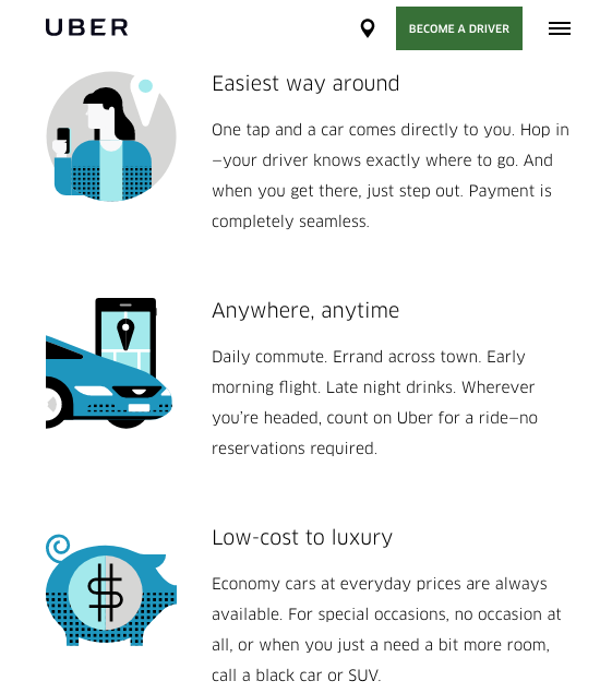
"A website that has a great responsive design is the new Uber webpage. When looking at the website at different screen sizes, the content automatically adjusts and keeps everything in a neat and well-formatted layout. The page progressively enhances as you scroll down on the page, as more content loads and appears, giving the user more options to look at different content. The navigation bar appears at the top of the screen as you scroll back up on the page, making it easier to navigate the website. Also, when you hover over an image, it increases in size, letting you know that is what you are bout to click on."
Research for this article came from Uber.design